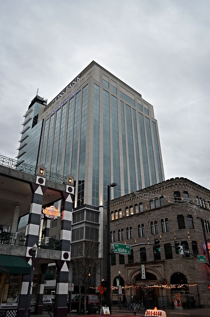
The more I look at the picture the Gardner Company presented to the city, the flat dark gray paint is dull and cheap looking, but it's their building. They are trying to placet a few people, which they should have just ignored. Now it's costing them thousands of dollars and it will never satisfy everyone. I wish they had used the glass design, but again it's their money and time for a part of the building that in the long run will stand out over other buildings roofs that will go up.
It's like when the Ford Edsel came out, and the designer thought "this is great"...NOT.
AC Martin's vision for their spire on the Wilshire Grand in Los Angeles is fantastic. A word I can't use for the spire boxes on 8th&Main.
The tower otherwise came out great...just disappointed with the Babcock design of the boxes. The spire itself is great.


 Prev
Prev


 Linear Mode
