Someone on here pointed out years ago how so many town logos use blue and green. Saw a video on tik tok of the logo for Bridgewater NS and the Mississippi River Museum in Iowa. And it was pointed out that this logo basically exists everywhere in the world. A Google reverse image search very much demonstrates this. Also, instead of a B or a river, there's an S for Schulich School of Business at York U. Not sure why Schulich has a couple of leaves. You'd think it's for the department of environmental studies or something.
__________________
The whole problem with the world is that fools and fanatics are always so certain of themselves, and wiser people so full of doubts. (Bertrand Russell)
__________________
The whole problem with the world is that fools and fanatics are always so certain of themselves, and wiser people so full of doubts. (Bertrand Russell)
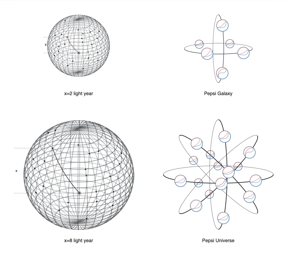
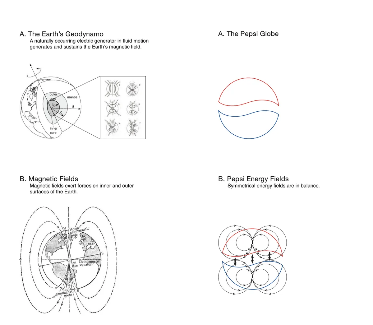
yes, that is at least 1000 times better. I don't know why I hated the previous Pepsi logo...probably because that brand doesn't seem to know what it wants to be, and probably also due to the insane and preposterous horseshit that was part of the rebranding report. It was truly insane and preposterous horseshit.
__________________
The whole problem with the world is that fools and fanatics are always so certain of themselves, and wiser people so full of doubts. (Bertrand Russell)
King of Pop? Definitely not the King of Soda Pop. Jackson expressed that he didn't really like Pepsi and had agreed with them on not holding a Pepsi can and not drinking Pepsi during the commercial because he didn't like it.
__________________
The whole problem with the world is that fools and fanatics are always so certain of themselves, and wiser people so full of doubts. (Bertrand Russell)


 Prev
Prev


 Linear Mode
