Quote:
Originally Posted by trueviking

exactly!
Cutting open the wall to expose the gift shop is like painting over a Monet because you want the colours to be more vibrant.
The shifting angles of stone from that specific point is the embodiment of the entire design concept in one move. Its where the two planes diverge from each other. a critical moment in the design. In that one move at that precise point the folding angles of the building are expressed. It is a very powerful move, done with exquisite subtlety. Cutting it open and filling it in with storefront curtain wall is a ham fisted desecration of a timeless masterpiece.
The power of the entry experience relies on the juxtaposition of the deep opening and the imposing visual weight of the stone wall as it slides beneath the dramatic cantilever above. That experience is now gone. Its not a f*cking strip mall.
The architects should be ashamed.
|
If they actually deface this timeless gem, as Vike aludes to, I'm afraid that Adelaide Station becomes my new go-to modernist blank wall in the downtown area.
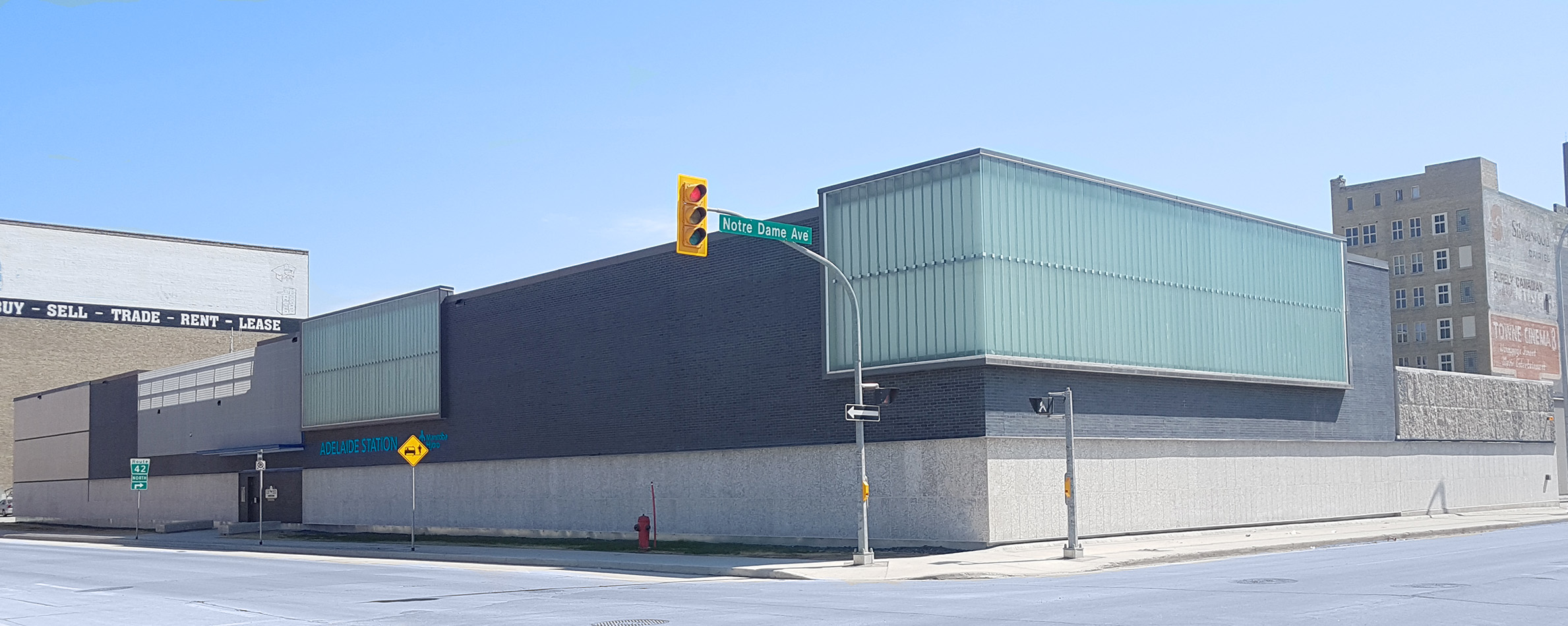
Adelaide Station, for those that are unfamiliar, is an absolute masterpiece at the corner of Hargrave and Notre Dame. You'll notice the intentional juxtaposition of tyndall stone and black brick, a rare finish in these prairie streets. The black brick is a subtle nod to rain clouds, which when they erupt and spill their rains onto the prairie landscape, create the lifeblood that powers our northern dams and provide hydro electricity. Not to be overlooked are the twin 'benches' at the western entrance. They pull pedestrians in with their sharp edge features, and encourage them to sit to admire the imported landscaped yard (Kentucky bluegrass). On the Notre Dame facade, the urban design team made certain to bring the outer wall flush to the sidewalk. This intentional design intervention was made to bridge old and new, modern and heritage. The mini-cantilevered section at the corner pays homage to
The Spot apartments at 2815 Pembina Highway, connecting the edges of the Old Chinatown and the New.
While our resident arbiters of taste will shun the station's lack of permeability, it should be highlighted that at close proximity, the experience walking alongside it is nearly identical to walking next the WAG. For those who will forever shun the artwork at 300 Memorial due to the tiny addition of glass windows, please do not discount the opportunities that await at Adelaide Station!


 Prev
Prev


 but I do sympathize with those that are against the change.. but it doesn’t bother me.


 Linear Mode
