Pops of color within a building scheme can be tasteful, like the Portland example above (which is just painted railings not colored panels), but more often than not they look cheaply done, like the Denver and MPLS examples.
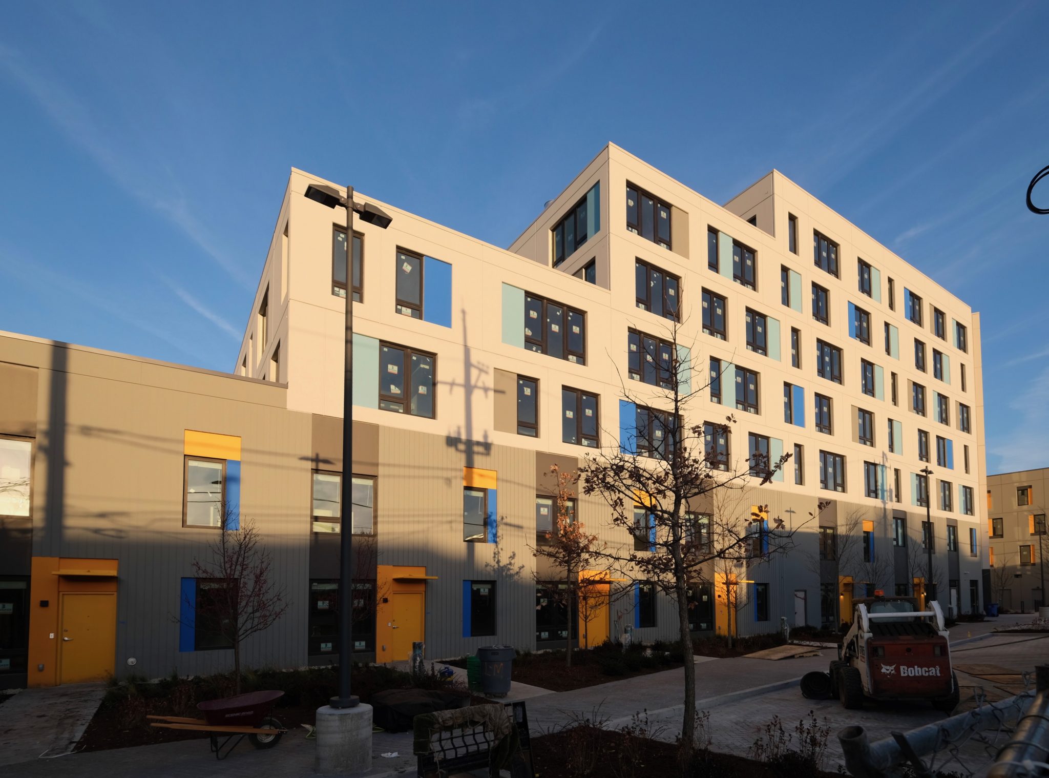
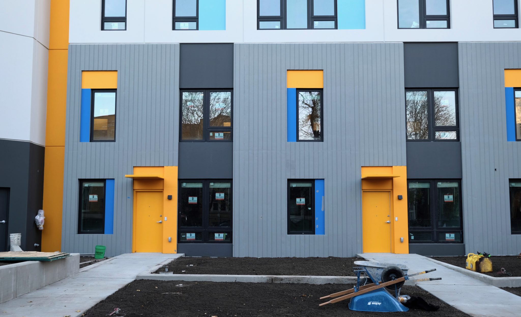
Chicago has a few examples of tacky colored panels on market rate housing (see 160 N Elizabeth), but the affordable developments are often over-the-top. From an optimist's POV, they add a splash of color to a cheap building. From a realist's POV, it's easier to get local support for an affordable development if the building is obviously cheaper-looking than the neighbors' full-priced homes, even if it means their neighborhood looks tackier.
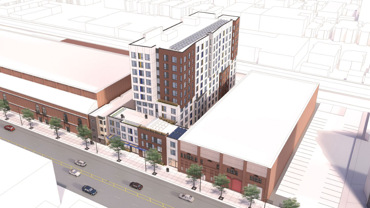
This isn't to say every building should be expensive masonry or uniformly designed. It's just many of these developments feel like they're rounding third base with a solid building design and then decide to add colored panels to dumb it down. On the bright side, they're relatively easy to paint/replace.
Imagine if the Emmett Street Apartments in Logan used bronze and/or black accent panels and matching paint for the doors. It'd look 10x better for a marginal cost bump.


 Prev
Prev


 I guess we should go back to building commie-block warehouses for people, right? It needs to look like poor people live there!


 Linear Mode
