Right on cue!

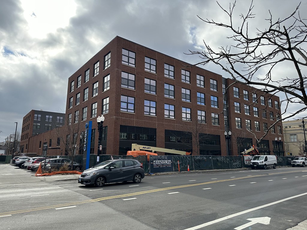
The only nice thing about this building is the scale, which is basically a function of zoning and the developer's proforma. We've got jumbo utility brick in a flat red color, control joints and flashings handled in the most clumsy way imaginable, and the cheapest window system they could get. No relief or pattern to the brickwork, no division between the commercial ground floor and residential above, no treatment of the building crown at all. This kind of simplicity can work, but the execution has to be perfect. That's not what happened....
The only semi-decent part of this building is the side elevation where it steps down from all-brick, to nice rhythmic brick piers, to all-siding. Keeping the mature trees on that side was good too. but notice how the stair-stepping effect distracts from the shitty construction details. If you can't count on your GC/subs to deliver top notch quality, you can't rely on minimalism and you've gotta distract the eye somehow.
Quote:
Originally Posted by UPChicago

I would suggest that the architecture we see in the neighborhoods, at this scale of density, from local firms is not simply plain but extremely bland and lacking in character for the most part. Yes, there are outliers, but I feel this is generally true. Bringing in outside talent to set examples for good design is a good thing.
|
Quote:
Originally Posted by gandalf612
|


 Prev
Prev


 Linear Mode
