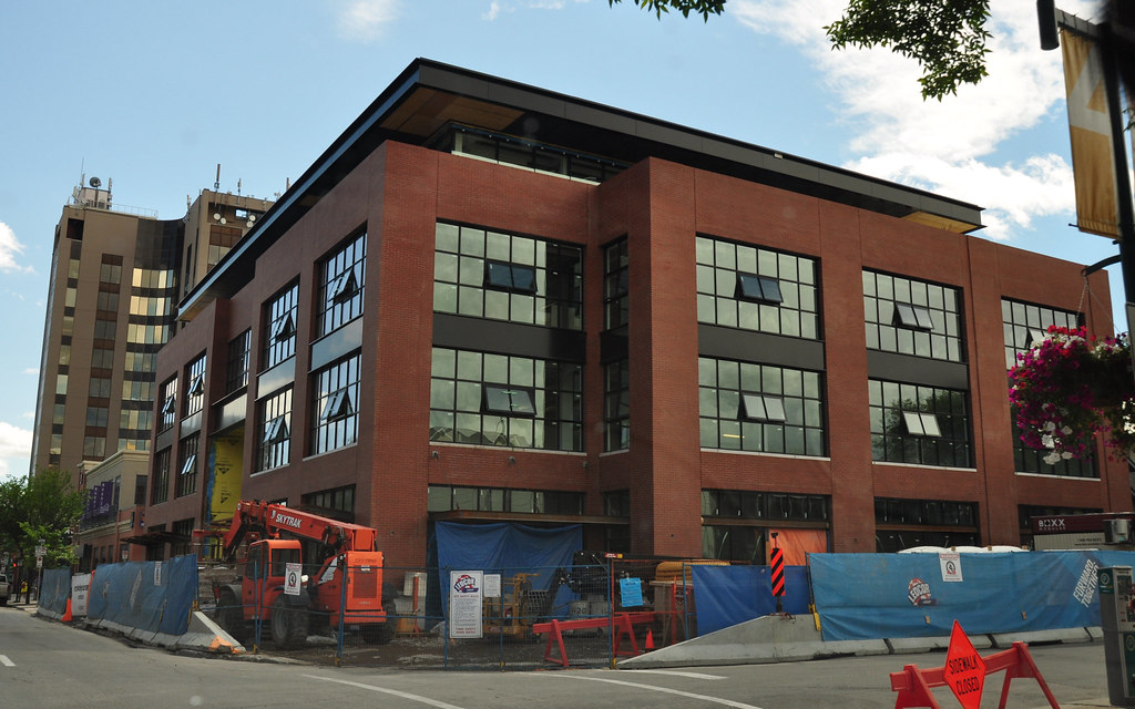
Personally I like it. I don't love it, but there are three things I like about it.
-A nice simple massing that doesn't necessarily stand out, but doesn't offend. It blends into the surrounds well.
-They used brick but doesn't look like stampitecture because they've put the detail into the windows rather than use cornices, etc...I think this building will stand the test of time.
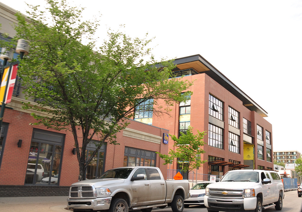
-The street level (retail bays and main entrance) looks to be open and welcoming to the pedestrian realm - we'll know better once it's complete, but that's what it looks like so far.
I voted love it. But on second thought, I wish it was another 2 or 3 stories higher. These scale of buildings are great cornerstones for a mixed use and vibrant neighbourhood.
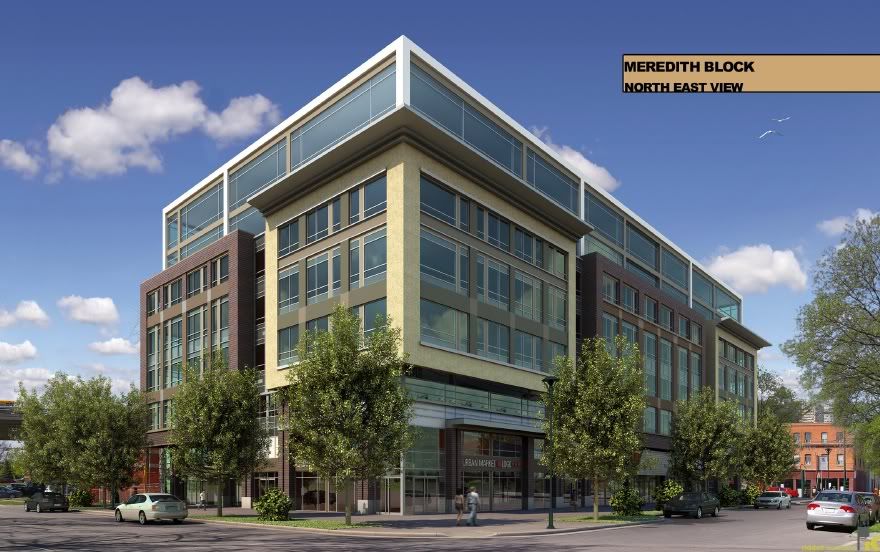
I think Remington's Meredith Block in Bridgeland does it better:
Great urban design - scale and use perfect for the street. Really like the design concept, wish it had a nicer, slightly darker coloured brick. Overall - an 8/10.
Great urban design - scale and use perfect for the street. Really like the design concept, wish it had a nicer, slightly darker coloured brick. Overall - an 8/10.
I really don't get what people like about this building, if it had a cornice then it would totally be Stampitecture. With the fake sandstone on the bottom it's even more historicist, as it looks like all the old warehouses in Victoria Park. As I said before, we need modern architecture that is Representative of it's time and place, by that I mean NOW not 1910!
The top part looks cool though, like the Roy-Op block (or the new on on 11Ave and 4st that's starting up) an old building with a new part on top.
I think its fine. The design and the transparency of the big windows are nice, Has a more modern vibe to it that the standard Stampedtecture shite. I think after the street level is completed to reflect more of the renderings with the light fixtures, etc I'll like it more.


 Prev
Prev


 Linear Mode
