Quote:
Originally Posted by jc5680

Beige is a warm color tone. I was not using abstract descriptions. A warm orange-sh beige and a cool blue-ish glass sit somewhat opposite each other on the color wheel. That makes them complimentary and high in contrast.
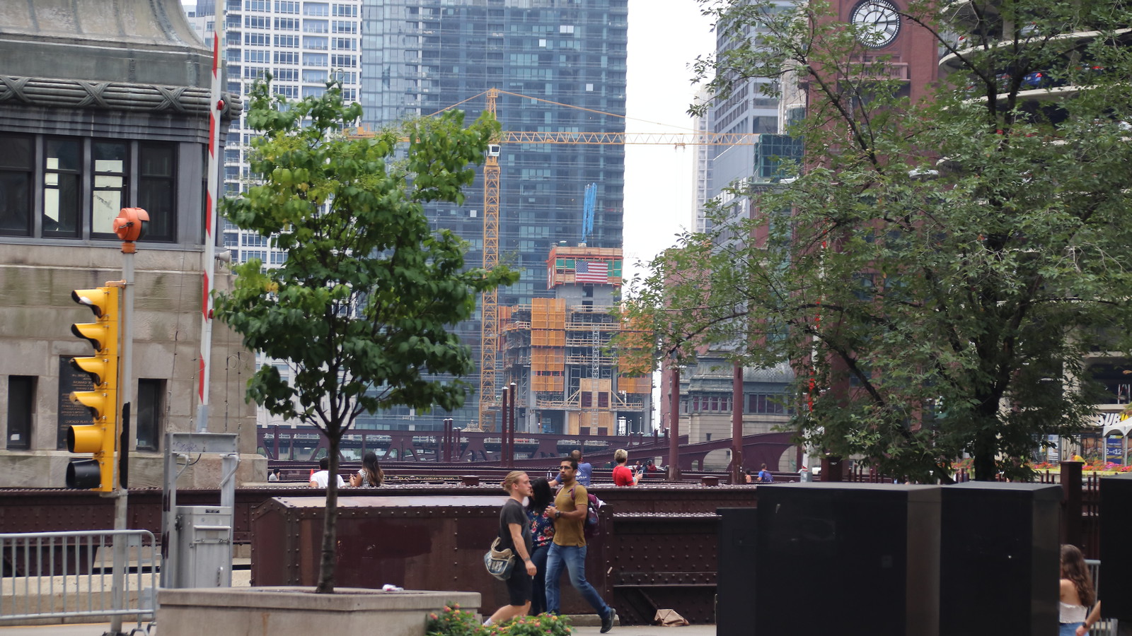
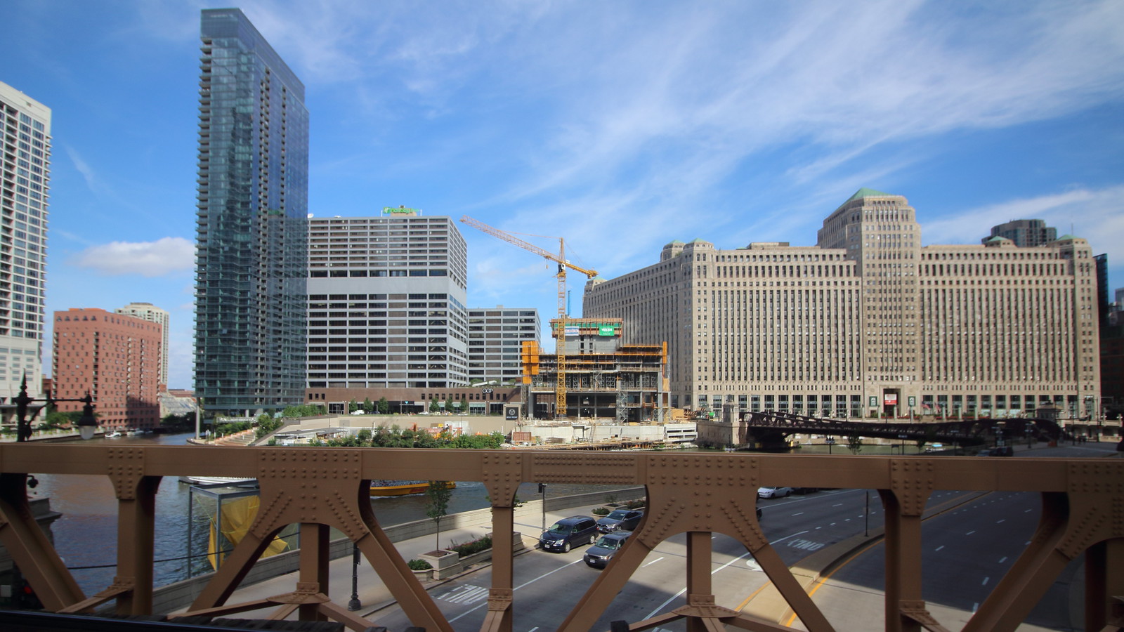
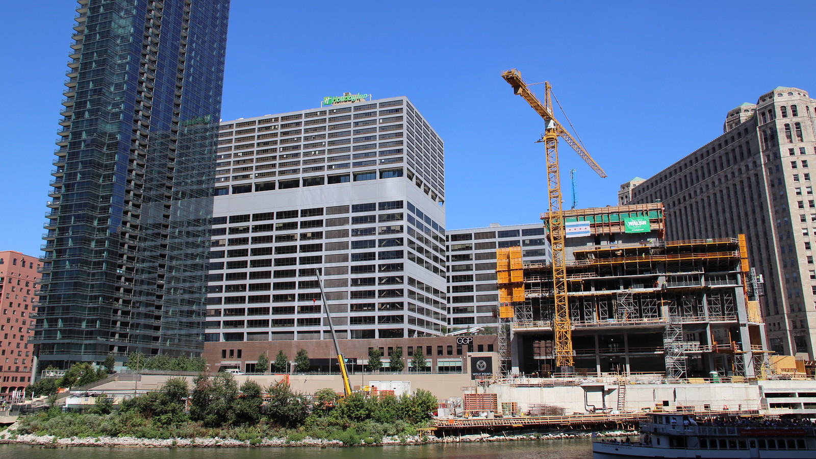
Despite what you feel, color relationships follow practical rules. And while you may find it easier to look past the building in the background (going to happen regardless when you put large objects in front of it) the net effect is that the gray will also serve as a worse backdrop in terms of making the buildings in the foreground stand out.
You can already see the reverse of this effect when viewing the apparel mart from the west—like Kinzie/Desplaines. It now stands out more than it had against a backdrop of River North beige.
|
I guess we'll just have to agree to disagree because my experience seeing it every day is different than what you are saying.
As for Kolchak, I think you know what I meant by old Sun Times building...
This conversation is teetering on passive aggressiveness, so I'm just gonna step away from it now.


 Prev
Prev


 Linear Mode
