Quote:
Originally Posted by BK1985

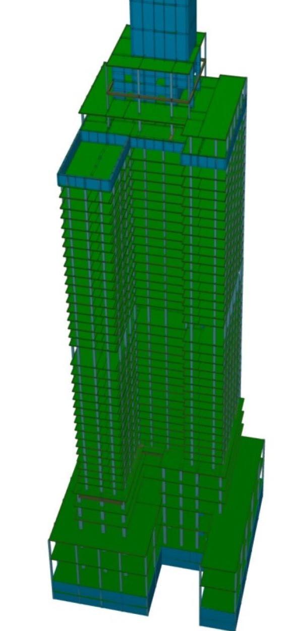
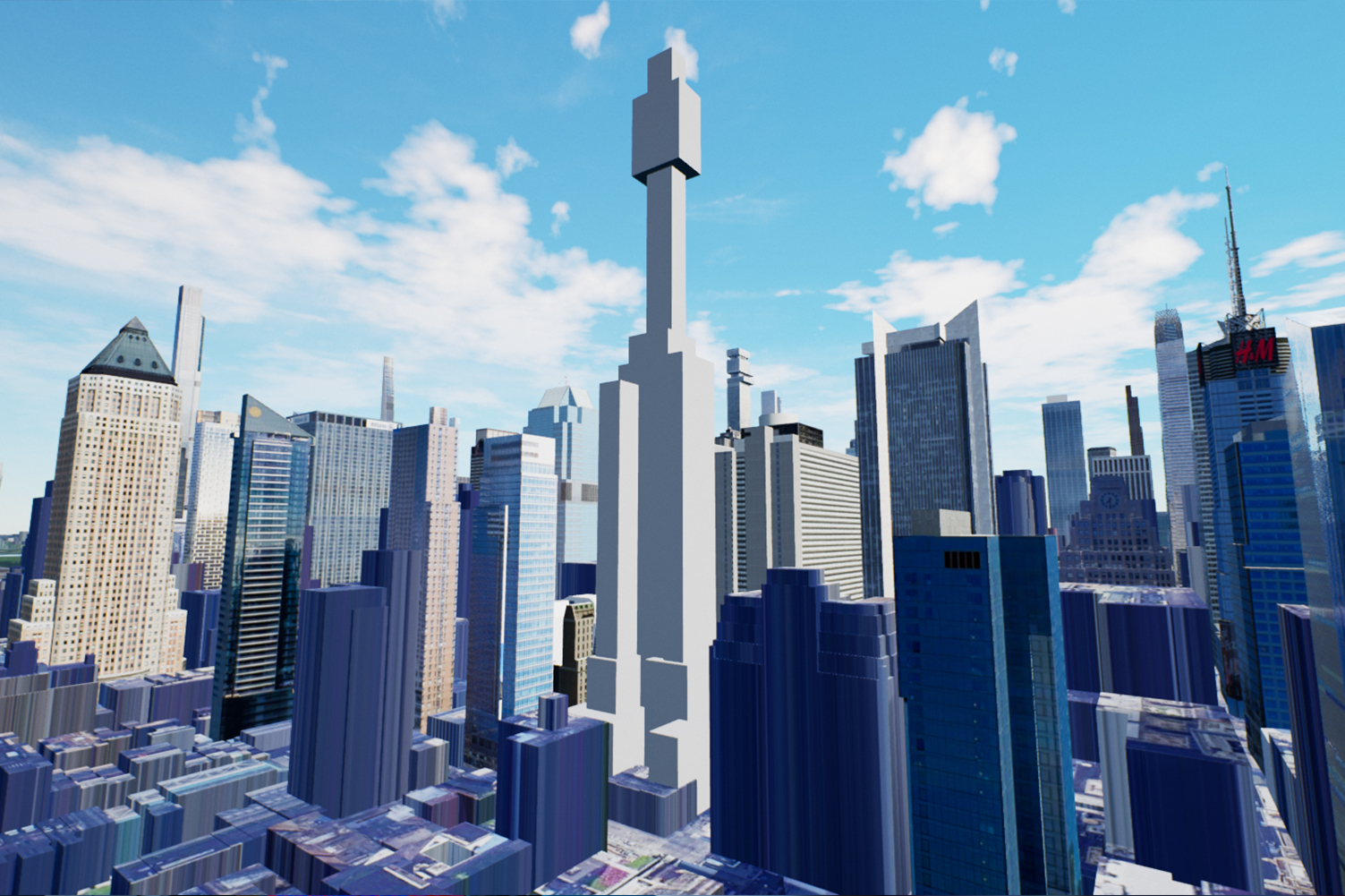
After throwing up in my mouth a little, I think this could be ok if its not the boxy mess in the graphic. I'm hoping that its just a study image and not indicative of the actual design.
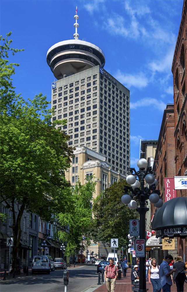
Perhaps they can follow the idea of the Sydney Tower but with a more modern design.
|
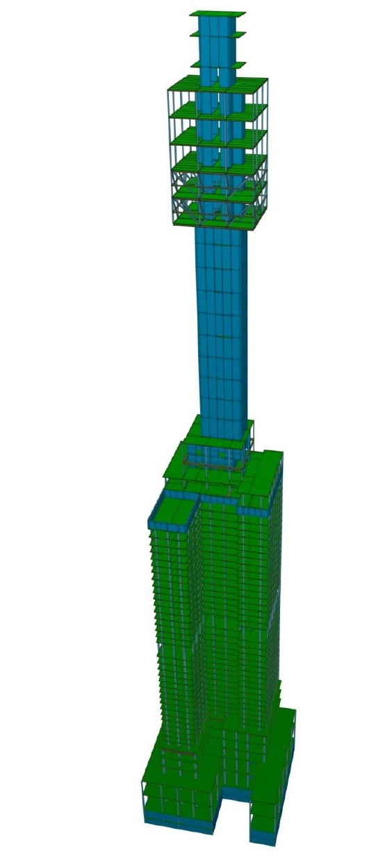
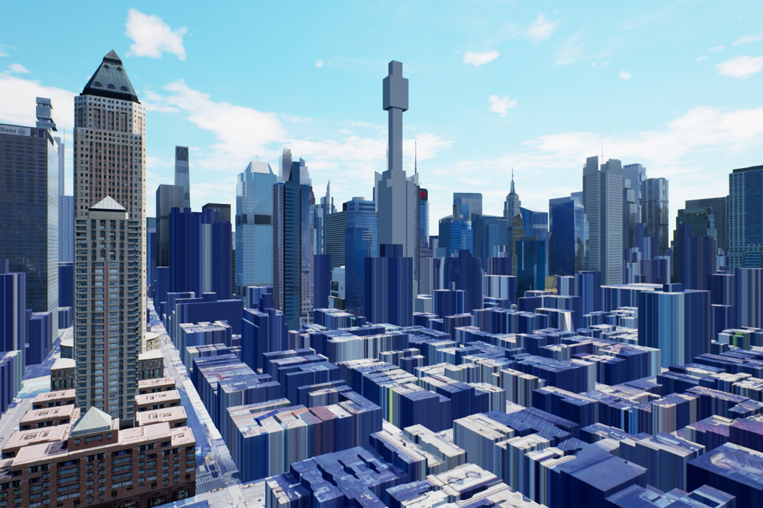
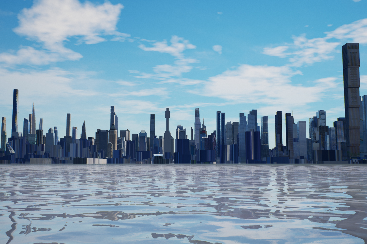
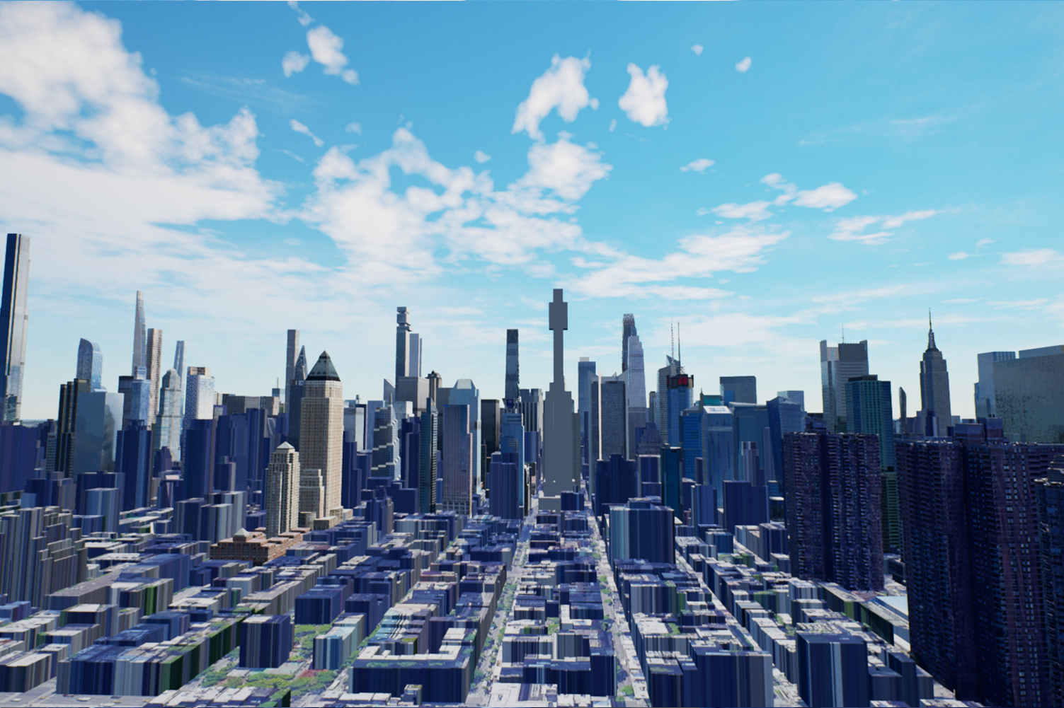
Well, the angle of the massing can be a little misleading. That mast is only supposed to be about a quarter of the height, but it looks larger from that angle...
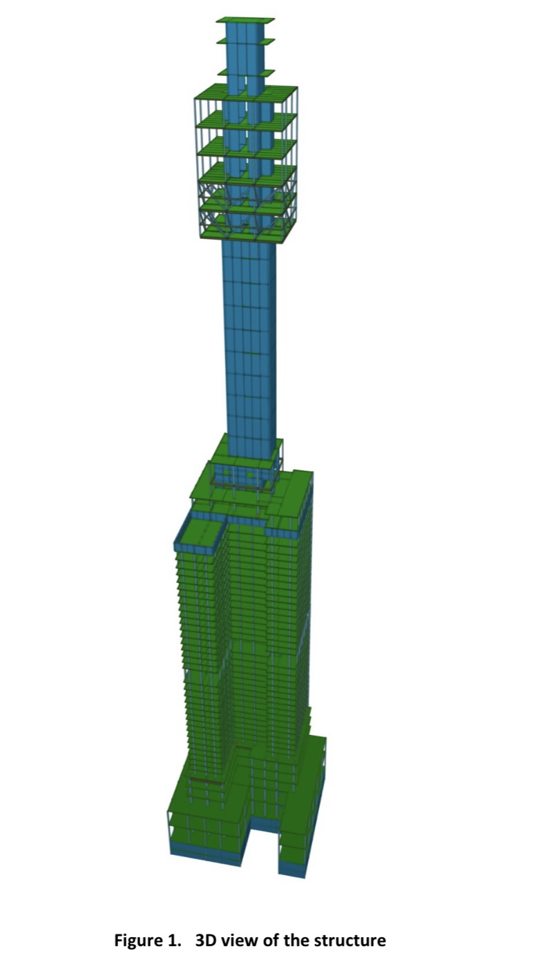
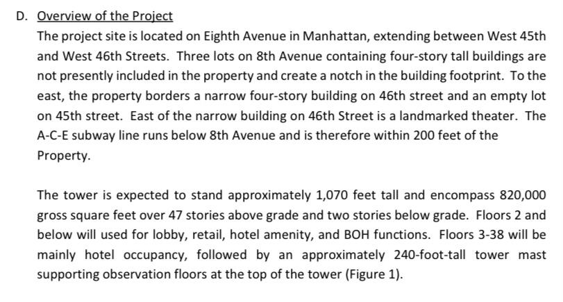
I think there may still be more filling in for the tower itself.
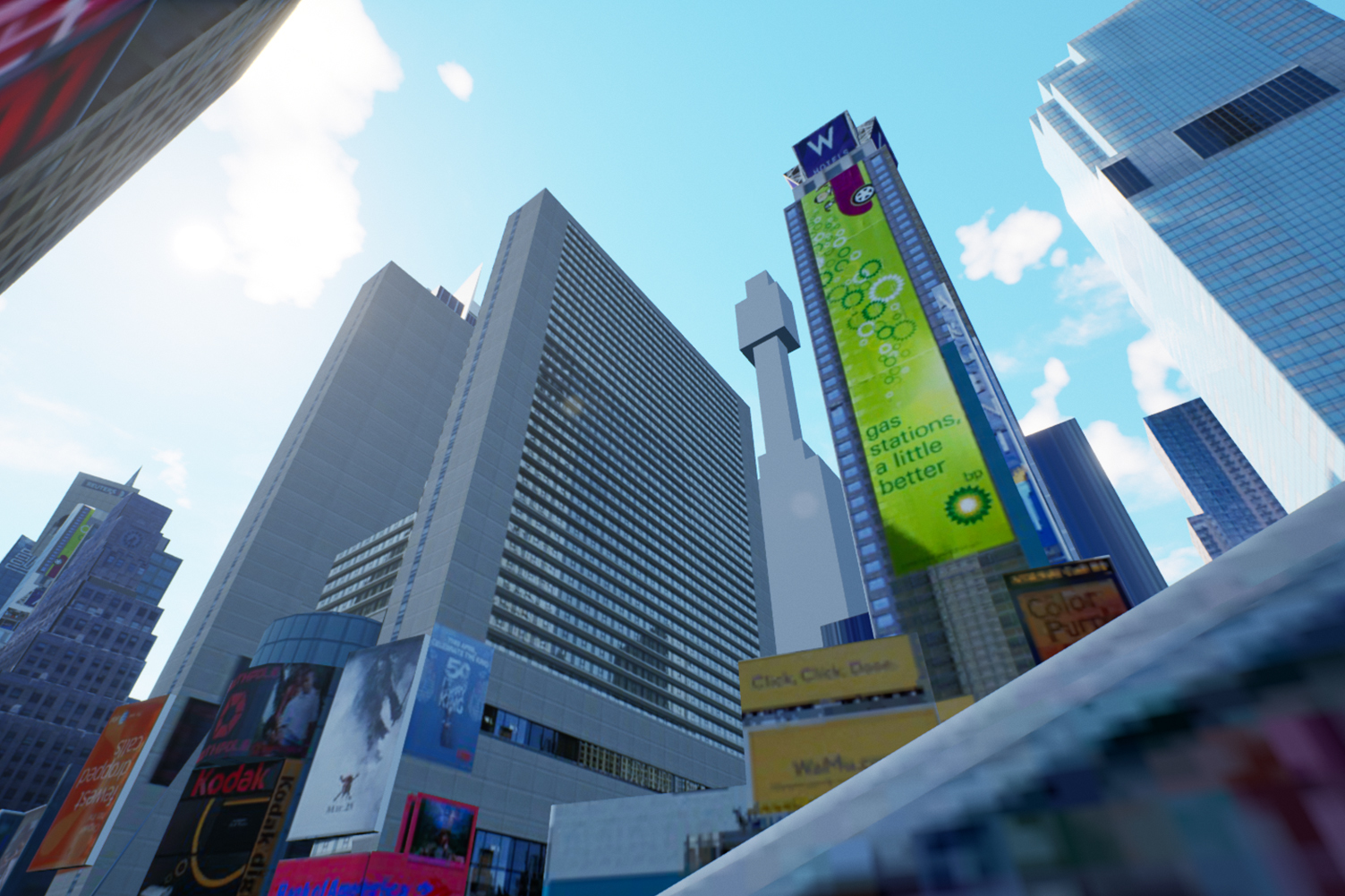
Maybe if it were something like Foster's "Tulip", but it would still need more height to fit in with the skyline.
Barnett could have something like this in mind, though a boxier version...
 https://thetulip.com/


 Prev
Prev


 Linear Mode
