Quote:
Originally Posted by the urban politician

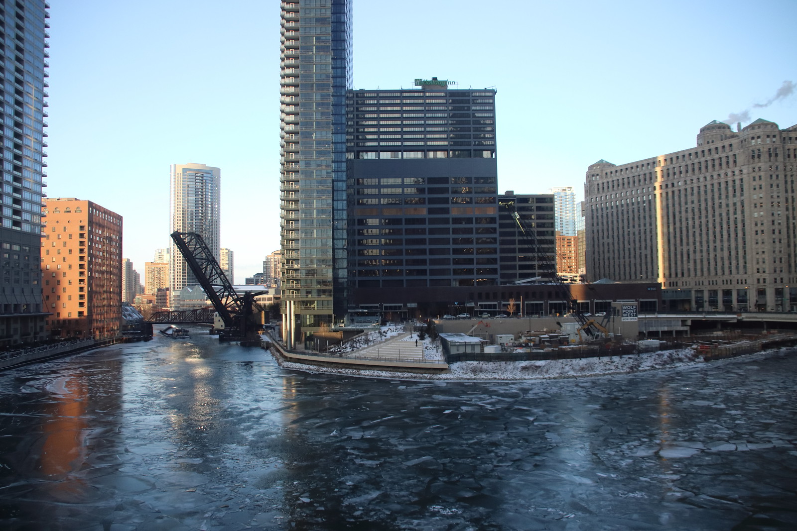
The Holiday Inn repaint was a good aesthetic move, IMO
|
They gray currently up looks very bad. (Solar’s photo makes it look OK, but it looks quite different in person) I am still holding out that this is just a primer. Of the test swatches they painted this was easily the worst one for the building. The dark brown that was similar to the base or one of the lighter options would have been better.
Tonally, the tower doesn’t have enough contrast with the base anymore so there is a weird visual tension that wasn’t there before. Even worse, even though the building is wasn’t great, the light beige would have been a great backdrop for the glassy gray/blue buildings in front. The color contrast would have helped make the foreground buildings stand out more. Now it will look like a muddy dark mess.


 Prev
Prev


 Linear Mode
