Quote:
Originally Posted by NYguy

To each his own. As far as I'm concerned, the design on the right is clearly better. The setbacks also align more properly with the Chrysler's spire, which is great.
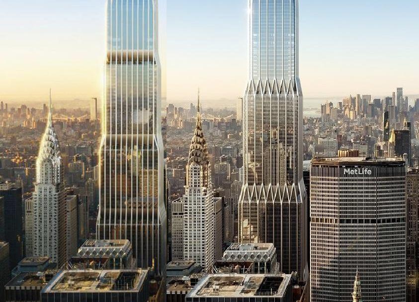 |
I like the triangles in the 2nd version more, but I think I like the thicker mullions in the first one. Just makes it better defined I think. And I also think it makes the windows appear to have more depth, which I think looks better.