St.George has become a place where young professionals and "hipsters" have found relatively low rents relative to it's distance from Manhattan. Some fellow Staten Islanders worry that the Wheel (+ hotels & outlets) will drive up the cost of rent in the immediate area. This is likely true, but I happen to think this is a good thing, and I'll try to explain why with this map I created:
Disclaimer: I'm partially colorblind, so bear with me on the colors. Also, I didn't take the time to make the boundaries exact by looking everywhere in the neighborhood with google street view.
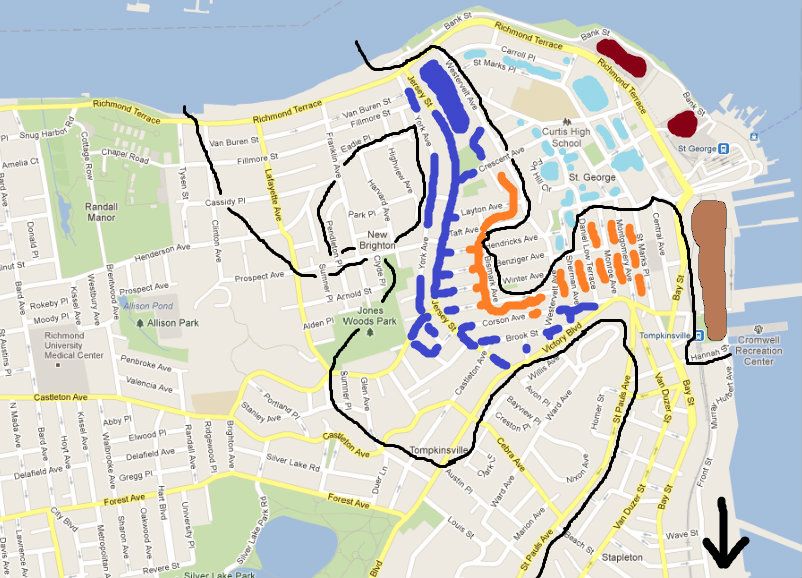
-The Maroon spots near the ferry terminal represent the site for the proposal.
-The large green spot south of the terminal represents an area that has been revitalized over the years. Some of the buildings are new, and some were renovated. It's mostly residential, but there is a fitness center and a public swimming pool there as well. Plans for a National Lighthouse Museum have been in the works for well over a decade.
-The turquoise spots nearest to the terminal are apartment buildings with higher rents compared to the surrounding area. But again, relative to it's proximity to Manhattan it is fairly affordable.
-The turquoise dots further up the hill from the terminal are large old houses on tree-lined streets.
-The black line represents (as best as possible) the boundary between nice and not-so-nice neighborhoods.
-The Orange spots are areas that look a little run-down and have cheaper rents. However, I've spent a lot of time in this portion of the neighborhood over the years, and I've noticed that some young professionals have moved in, and their landlords seem to be doing better upkeep on the buildings.
-The Blue spots are not-so-nice areas that haven't seen any real gentrification, redevelopment, etc.
-Notice the black line that forms a circle where it says "New Brighton". This is quite a nice area surrounded by low-rent, somewhat unkept blocks. I included this on the map merely as an example of how very small areas can provide an anchor for revitalization or an increase in quality housing along the perimeter. I doubt the wheel will have much of an immediate impact on the area, so I didn't color code it.
-The black arrow in the bottom right corner points to Stapleton, another area that is primed for revitalization. There were poorly executed attempts to make the waterfront a motion picture studio hub, as well as a Naval Base. More reasonable approaches seem to be taking hold, and quality housing will likely be built there to take advantage of the excellent views, as well as the proximity to the ferry and the Verrazano.
***The rents will go up in the area surrounding the Ferry, but I predict that some of the borderline areas (orange on the map) will rapidly improve while remaining affordable. Perhaps in the years following, quality housing will spread from there. Even in the blue areas there are many houses that could be very nice if they were better cared for. Other than concerns about traffic, the arguments against the Wheel simply don't hold much water.