These are fair points - "better than nothing" is a low bar, and I certainly agree that it feels disconnected and lacking in context. Here's a more detailed and nuanced analysis on the project (that no one asked for

) :
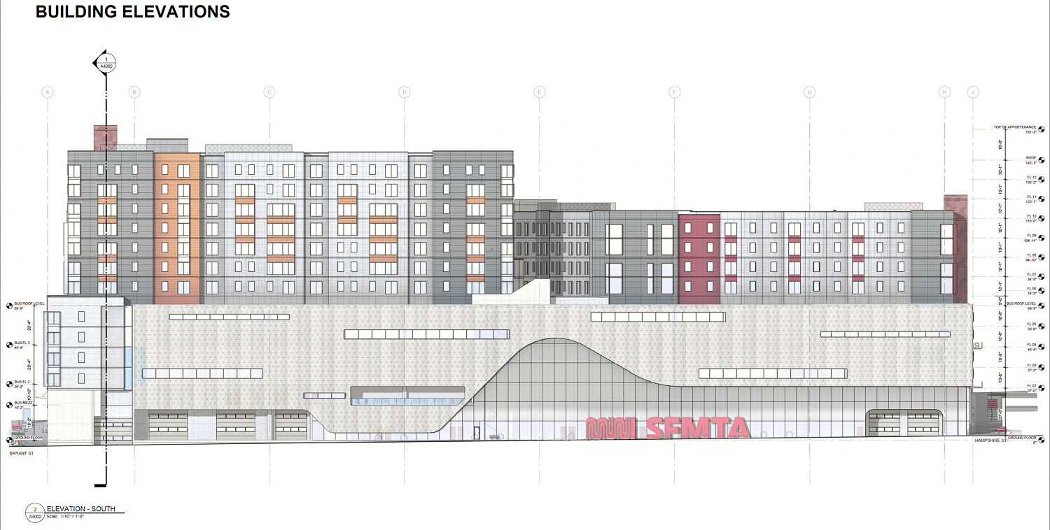
Let's start with the Mariposa Street side. This is the main entrance for the busyard facilities, and the side with the most height/bulk. I appreciate that they are using a lot of glass on this side, which makes the pedestrian level less intimidating. The scale of the parking podium and the housing perched on top of it reduces this, however, as the height and mass looks pretty unfriendly. The wavy form of the facade helps break it up a little bit, but overall it could be better. I'm less sure what could be done to fix it while still meeting the functional needs of the two very different halves of the project - one place to start might be removing the long, narrow windows which feel out of scale (and remind me of some of the failures of the SFMOMA expansion).
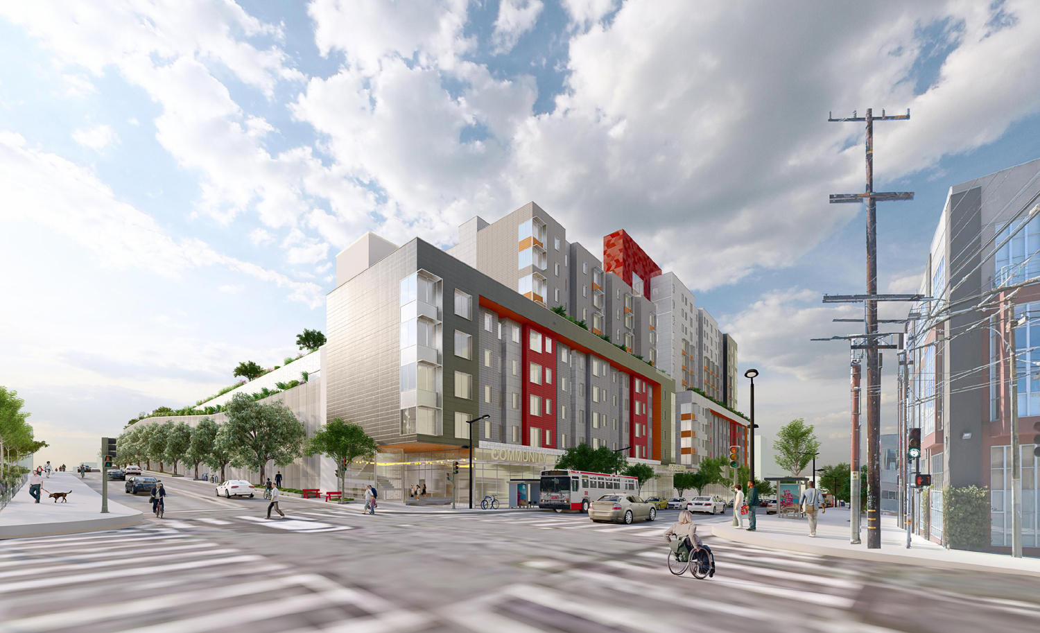
The Bryant Street frontage is the most "activated," with no podium and housing down to the second floor and retail on the ground level. The architecture of the residential portions is relatively in line with many of the Mission's recent high-density projects-- not hugely offensive but a long ways short of inspired.
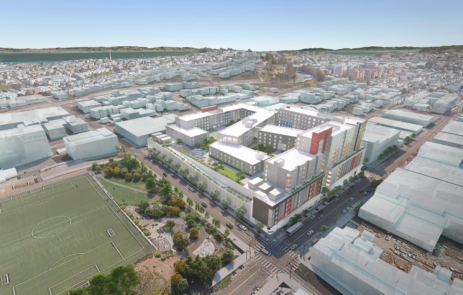
I take the most issue with the 17th Street frontage. It's bleak and unfriendly, with no activation besides a small retail space on the corner with Hampshire. This is facing a large park, and represents a major missed opportunity to interact well with Franklin Square and create some more vibrant uses around the park, which currently suffers from being surrounded by inactive and car-oriented uses. This would only go to further that.
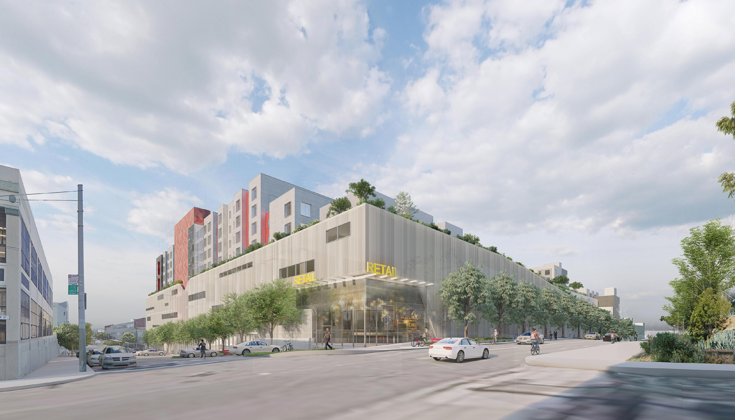
Finally, we don't have a full render of the Hampshire frontage, but based on what we can see it doesn't seem too friendly either - less mass than the Mariposa side, but similarly blank and dead to the 17th frontage. The retail on the corner is nice, but falls far short of creating an active streetscape. The residential parts of the structure are totally separated from these two frontages, which takes away eyes on the street and hurts the pedestrian experience.
So overall, taking a closer look I mostly agree with everyone here, except that I still think that this is the best we can hope to get. The engineering and logistical challenges with designing this site are pretty intense, and likely very expensive. High-quality design is going to get lost in the process. Should it be this way? Ideally, no, but in SF's current development environment, this is what we get. It sucks, but with the acute housing and transportation challenges that this project helps address, there doesn't seem to be much choice.