SkyscraperPage Forum

SkyscraperPage Forum (https://skyscraperpage.com/forum/index.php)
-   Completed Project Threads Archive (https://skyscraperpage.com/forum/forumdisplay.php?f=348)
-   -   CHICAGO | BMO Tower | 727 FT | 50 FLOORS (https://skyscraperpage.com/forum/showthread.php?t=224752)

CastleScott Dec 11, 2018 5:08 AM

Oh btw I come into Chicago at times on either Amtrak's California Zephyr or the Southwest Chief so it will be cool coming in beneath it.:yes:

TallBob Dec 11, 2018 6:03 AM

BMO expanding in Chicago and RBC (via Harris Bank) is looking to expand it's presence developing the Gateway tower in Minneapolis....Oh Canada!

Vlajos Dec 11, 2018 3:42 PM

Quote:

Originally Posted by TallBob (Post 8404886)
BMO expanding in Chicago and RBC (via Harris Bank) is looking to expand it's presence developing the Gateway tower in Minneapolis....Oh Canada!

I'm not following. RBC has nothing to do with Harris Bank.

The Best Forumer Dec 11, 2018 4:19 PM

Quote:

Originally Posted by ithakas (Post 7814418)
I'm bummed we're not getting the gorgeous SOM design but actually prefer the programming of this – time to get more mixed-use in the area.

Maybe this will compel Sterling Bay to go for another site in West Loop Gate for their proposal. They could site it two blocks south at Harrison & Clinton, on the full block where the Holiday Inn and parking lot are, across the street from the Old Post Office.

Horrifying design. Terrible buildings. Chicago can do better than this....

barf.

munchymunch Dec 11, 2018 5:01 PM

Quote:

Originally Posted by The Best Forumer (Post 8405098)
Horrifying design. Terrible buildings. Chicago can do better than this....

barf.

Wished GP switched it up a little bit, I get that they have a certain style, but at this point it’s just getting repetive.

Ned.B Dec 11, 2018 6:22 PM

Quote:

Originally Posted by munchymunch (Post 8405145)
Wished GP switched it up a little bit, I get that they have a certain style, but at this point it’s just getting repetive.

It's funny that you say that as your signature quotes the guy who believed that a universal aesthetic language could be used for every building on every site.

I think while some of the big moves on this building are the same as used at 110 N Wacker, the specific details of the base, lobby, curtainwall etc. are going to make them feel like very different buildings, especially when experienced from the street level. And 110 no longer has this 3 step massing, it's more about the way that the facade steps horizontally to follow the river.

LaSalle.St.Station Dec 11, 2018 9:02 PM

Is it feasible that the old Florshiem building North of Union Station can be developed? Is it currently apartments or condos?

LaSalle.St.Station Dec 11, 2018 9:04 PM

Duplicate

pilsenarch Dec 11, 2018 9:05 PM

Quote:

Originally Posted by LaSalle.St.Station (Post 8405437)
Is it feasible that the old Florshiem building North of Union Station can be developed? Is it currently apartments or condos?

condos

munchymunch Dec 11, 2018 9:53 PM

Quote:

Originally Posted by Ned.B (Post 8405230)
It's funny that you say that as your signature quotes the guy who believed that a universal aesthetic language could be used for every building on every site.

I think while some of the big moves on this building are the same as used at 110 N Wacker, the specific details of the base, lobby, curtainwall etc. are going to make them feel like very different buildings, especially when experienced from the street level. And 110 no longer has this 3 step massing, it's more about the way that the facade steps horizontally to follow the river.

I dont have a problem with GP buildings they are always pretty well done, and turn our nice . However they have shown that they are capable of something different (UBS, Transbay etc.) Excluding 150n Riverside, recently I’ve felt their office tower designs have been looking very similar in Chicago.

And I hope you’re right about tje details, something interesting like 150’s Curtain wall would be nice.

spyguy Dec 12, 2018 5:20 AM

https://i.postimg.cc/NjZ5Ypw7/file.jpg
Looks like they are borrowing some elements from Viceroy for the facade.

Donnie77 Dec 12, 2018 5:37 AM

Quote:

Originally Posted by spyguy (Post 8405848)
https://i.postimg.cc/NjZ5Ypw7/file.jpg
Looks like they are borrowing some elements from Viceroy for the facade.

Nice touch on the columns!

LouisVanDerWright Dec 12, 2018 1:28 PM

I didn't realize they were going to have matching column trees on both sides. Details are excellent on this one, should be a stunner haters be damned. Glad we are getting the 3 tier structure we lost on Wacker.

Also, this is going to be a big skyline changer as it's the furthest West 700'+ building in the city. From the South it will help bridge the gap to the West Loop and from the West on 290 it will fill in the space between Sears and 311.

Skyguy_7 Dec 12, 2018 2:36 PM

^That is a nice touch.

I hope the contrast between light and dark window panes is as defined as the rendering shows. I also hope the two colors of glass comes out as a very dark blue and a shade of silver. No more blue glass!

EDIT: Disregard my observation. See JC's post on next page.

Steely Dan Dec 12, 2018 3:11 PM

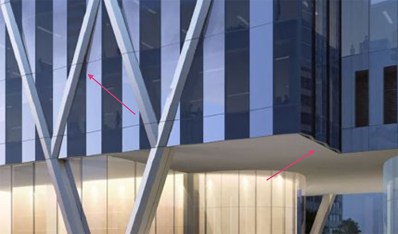
i love that the column "trees" now come together and touch the ground at a single point as opposed to the crisscross pattern seen in this earlier rendering below.

https://s8.postimg.cc/ffpcrme2d/image.jpg


and yes, double cool that the column trees will be on both the park and street sides of the tower! that's one dead sexy base.

tjp Dec 12, 2018 4:09 PM

I hope this development plus the post office redevelopment prompts the city to improve the Clinton blue line station. It's pretty dingy as-is.

tjp Dec 12, 2018 4:11 PM

Quote:

Originally Posted by Vlajos (Post 8404556)
Does BMO have sizable offices in the suburbs? I assume most employment is bank branches out there.

They have a pretty big operations center in Naperville.

jc5680 Dec 12, 2018 4:47 PM

Quote:

Originally Posted by Skyguy_7 (Post 8406013)
^That is a nice touch.

I hope the contrast between light and dark window panes is as defined as the rendering shows. I also hope the two colors of glass comes out as a very dark blue and a shade of silver. No more blue glass!

If you are talking about the hue differences on the faceted portion of the rendering it almost certainly is not different glass color; that is just light and shadow.

To that end, silver glass is just going to look blue anyways. Unless it has a very strong color profile most glass going to look blue in a ton of lighting conditions. Hand wringing over blue glass is pretty pointless in that regard.

rlw777 Dec 12, 2018 4:56 PM

Quote:

Originally Posted by spyguy (Post 8405848)
https://i.postimg.cc/NjZ5Ypw7/file.jpg
Looks like they are borrowing some elements from Viceroy for the facade.

Nice I am glad to see they've been refining the design. That facade is gonna look dope.

SIGSEGV Dec 12, 2018 5:10 PM

Quote:

Originally Posted by tjp (Post 8406117)
I hope this development plus the post office redevelopment prompts the city to improve the Clinton blue line station. It's pretty dingy as-is.

Yeah and it should have a Canal Street exit if possible. Direct office to the post office would be even better (and I think would allow covered access to Union Station as well via a platform).

jpIllInoIs Dec 12, 2018 5:27 PM

Quote:

Originally Posted by SIGSEGV (Post 8406197)
Yeah and it should have a Canal Street exit if possible. Direct office to the post office would be even better (and I think would allow covered access to Union Station as well via a platform).

IIRC the OPO and CUS train platform redesign includes a pedestrian tunnel to Clinton Station from OPO.

Vlajos Dec 12, 2018 5:49 PM

Quote:

Originally Posted by tjp (Post 8406121)
They have a pretty big operations center in Naperville.

Ok, didn't realize that. What do they do there?

Donnie77 Dec 12, 2018 7:38 PM

[QUOTE=spyguy;8405848]https://i.postimg.cc/NjZ5Ypw7/file.jpg

I love the way the building seems to levitate.

That appendage needs to be redesigned because it looks lazy.:notacrook:

Skyguy_7 Dec 12, 2018 10:40 PM

Quote:

Originally Posted by jc5680 (Post 8406165)
If you are talking about the hue differences on the faceted portion of the rendering it almost certainly is not different glass color; that is just light and shadow.

To that end, silver glass is just going to look blue anyways. Unless it has a very strong color profile most glass going to look blue in a ton of lighting conditions. Hand wringing over blue glass is pretty pointless in that regard.

That would be great if it’s light and shadow, much like the design of the west facade on 110 N Wacker, but judging by where the glass meets the “column trees”, it appears flush throughout.

Regarding my hand wrignging over the blue glass, I’m just envious of all the facade treatments that NYC’s boom is seeing . Silver, black, clear, bronze, terra cotta...

BonoboZill4 Dec 13, 2018 12:24 AM

I'm so happy they got rid of those awkward X-braces. The V braces look way better. This building taking out the worst parking garage in downtown makes this one of the best projects of the cycle, and that's whether or not the glass is mixed between black and silver/clear

Zapatan Dec 13, 2018 1:18 AM

Ooh I love it

bnk Dec 13, 2018 1:52 AM

Quote:

Originally Posted by BonoboZill4 (Post 8406773)
I'm so happy they got rid of those awkward X-braces. The V braces look way better. This building taking out the worst parking garage in downtown makes this one of the best projects of the cycle, and that's whether or not the glass is mixed between black and silver/clear

V braces might look better than X braces but from a engendering view point there are too many stresses on the mid V sections unless there is a thick steel I beam headers above the pic to alleviate that.
But even a thick header does not explain the lack of support at all 4 corners of the building unless the core is taking the load and it is just a cantilever building.

One should not put stresses in the middle of the V without making them worthy of the load.

IMO There has to be an unseen component of those Y braces from the top from prevent them from buckling the Y braces from expanding outward.


We wont know the real details and may never will unless someone has blueprints. But I am sure that it is compensated because no firm would do such a thing taking esthetics over form and function if it was not 300 years safe. But the pic looks unstable from the perspective of a lay viewer.

You just can't get away from downward and outward pressure on a V triangle brace in the middle if it is not mitigated and I am sure it will be but the pics do not show the beefing up needed.


The more I look at the pic the more I see the core handling down pressure and it being a cantilever building and the outside supports are just flourish unlike the JHC building that needed X braces for function alone.

Ned.B Dec 13, 2018 2:56 AM

Quote:

Originally Posted by bnk (Post 8406855)
V braces might look better than X braces but from a engendering view point there are too many stresses on the mid V sections unless there is a thick steel I beam headers above the pic to alleviate that.
But even a thick header does not explain the lack of support at all 4 corners of the building unless the core is taking the load and it is just a cantilever building.

The more I look at the pic the more I see the core handling down pressure and it being a cantilever building and the outside supports are just flourish unlike the JHC building that needed X braces for function alone.

I'm not following all of this. The triangle sections can easily be supported at the midpoint in an invisible fashion because there is a whole floor structure to brace them right there. The corners are only 25' cantilevers, which is not out of the range of possibility, especially if there is a hanger coming down from the nearest corner column above. A lot of buildings omit the corner supports as you can more efficiently do a half bay cantilever and have corner offices without a column.

And the serrated curtainwall appears to be real, versus an applied pattern as you can see the profile reflected in the edge of the cantilever's ceiling.

Skyguy_7 Dec 13, 2018 3:07 AM

^I see it now. Thanks. Going to be beautiful.

jc5680 Dec 13, 2018 3:25 AM

Quote:

Originally Posted by Skyguy_7 (Post 8406937)
^I see it now. Thanks. Going to be beautiful.

This is now redundant I suppose; in case others aren't sure you can see the folds in the glass along the lobby ceiling and angular shadows where the column trees span the folded glass. As spyguy noted, quite viceroy like.


pilsenarch Dec 13, 2018 2:51 PM

Quote:

Originally Posted by bnk (Post 8406855)
V braces might look better than X braces but from a engendering view point there are too many stresses on the mid V sections unless there is a thick steel I beam headers above the pic to alleviate that.
But even a thick header does not explain the lack of support at all 4 corners of the building unless the core is taking the load and it is just a cantilever building.

One should not put stresses in the middle of the V without making them worthy of the load.

IMO There has to be an unseen component of those Y braces from the top from prevent them from buckling the Y braces from expanding outward.


We wont know the real details and may never will unless someone has blueprints. But I am sure that it is compensated because no firm would do such a thing taking esthetics over form and function if it was not 300 years safe. But the pic looks unstable from the perspective of a lay viewer.

You just can't get away from downward and outward pressure on a V triangle brace in the middle if it is not mitigated and I am sure it will be but the pics do not show the beefing up needed.


The more I look at the pic the more I see the core handling down pressure and it being a cantilever building and the outside supports are just flourish unlike the JHC building that needed X braces for function alone.

these really aren't structural "V"'s, the architects just haven't chosen to represent any of the horizontal structure architecturally (also commonly referred to as floors ;) which are indeed cantilevered at the corners)

SamInTheLoop Dec 13, 2018 3:04 PM

Quote:

Originally Posted by Vlajos (Post 8405069)
I'm not following. RBC has nothing to do with Harris Bank.


Bob could have also just kept it to BMO, as they are also anchoring a new building in downtown Milwaukee.....

SamInTheLoop Dec 13, 2018 3:13 PM

Quote:

Originally Posted by simon07 (Post 8404845)
What I like most about it is that it will beef up the SW loop skyline. I think it will really pop when you are driving West on 94 (really north in that spot) that section of the loop can use some more towers to bulk things up a bit.


Same....that’s my favorite part as well. GP does fine work, and the details will be nice....it will likely be a nice, well-executed tower in its own right....however they’re repetitive af and I’d be fine with going a decade without another new GP office tower downtown after this one.....frankly, part of the reason I’m looking forward to Salesforce Tower so much is that it’s not designed by GP. (That and judging by how PCP’s neighboring WPE is shaping up, it’s likely going to be very sharp as well).

rlw777 Dec 13, 2018 3:38 PM

I am dubbing this the World Wide Web building due to it being impossible to not see WWW in the bracing after you notice it.

Ned.B Dec 13, 2018 4:14 PM

Maybe they are upside down BMO insignias

rgarri4 Dec 13, 2018 6:57 PM

It would be cool if the v shapes continued up the building instead of straightening out. Oh well. Interesting base boring everything else.

SpireGuy Dec 13, 2018 10:54 PM

Quote:

Originally Posted by Skyguy_7 (Post 8406654)
That would be great if it’s light and shadow, much like the design of the west facade on 110 N Wacker, but judging by where the glass meets the “column trees”, it appears flush throughout.

Regarding my hand wrignging over the blue glass, I’m just envious of all the facade treatments that NYC’s boom is seeing . Silver, black, clear, bronze, terra cotta...

You hit it right on the head. This tower is repetitive and banal. Chicago is not innovating the next generation of towers. NYC is doing that with the silver, black, clear, bronze, and terra cotta. At the very least, wouldn't it be great if they used bronze mullions on this tower? Blue and silver is already so sterile and cold. With our winters we could use some warmth in our buildings and diverse textures. :(

BonoboZill4 Dec 14, 2018 5:00 AM

Quote:

Originally Posted by bnk (Post 8406855)
V braces might look better than X braces but from a engendering view point there are too many stresses on the mid V sections unless there is a thick steel I beam headers above the pic to alleviate that.
But even a thick header does not explain the lack of support at all 4 corners of the building unless the core is taking the load and it is just a cantilever building.

One should not put stresses in the middle of the V without making them worthy of the load.

IMO There has to be an unseen component of those Y braces from the top from prevent them from buckling the Y braces from expanding outward.


We wont know the real details and may never will unless someone has blueprints. But I am sure that it is compensated because no firm would do such a thing taking esthetics over form and function if it was not 300 years safe. But the pic looks unstable from the perspective of a lay viewer.

You just can't get away from downward and outward pressure on a V triangle brace in the middle if it is not mitigated and I am sure it will be but the pics do not show the beefing up needed.


The more I look at the pic the more I see the core handling down pressure and it being a cantilever building and the outside supports are just flourish unlike the JHC building that needed X braces for function alone.

You seem to be overlooking the simple fact that the support structure can go well underneath street level...

Zapatan Dec 15, 2018 5:21 PM

Quote:

Originally Posted by SpireGuy (Post 8407986)
You hit it right on the head. This tower is repetitive and banal. Chicago is not innovating the next generation of towers. NYC is doing that with the silver, black, clear, bronze, and terra cotta. At the very least, wouldn't it be great if they used bronze mullions on this tower? Blue and silver is already so sterile and cold. With our winters we could use some warmth in our buildings and diverse textures. :(

It could have been more interesting I guess but I love the last rendering. The facade and lobby look really cool, and I'm digging the purple ish-color

Northwest Dec 17, 2018 10:03 PM

Quote:

Originally Posted by rlw777 (Post 8407352)
I am dubbing this the World Wide Web building due to it being impossible to not see WWW in the bracing after you notice it.

I'm getting vibes of West Virginia. Country roads. Mountain mama. West Virginia. Take me home. To the place. I belong.

ardecila Dec 18, 2018 12:37 AM

Quote:

Originally Posted by jpIllInoIs (Post 8406219)
IIRC the OPO and CUS train platform redesign includes a pedestrian tunnel to Clinton Station from OPO.

According to Mr. D, there will be a reserved pathway through this building's underground garage using the old Amtrak garage connection.

Quote:

Originally Posted by Mr Downtown (Post 8311375)
A passageway through the garage will be open to the public, offering all-weather access to Clinton & Van Buren.

After that, it's up to CDOT to build a one-block tunnel under Clinton to the Blue Line mezzanine. Ideally that would also include an elevator down to the CTA platforms. If we're lucky, the state office building along Clinton has a basement that can accommodate a passageway. Or maybe Gov. Pritzker will decide to tear down that ho-hum building and sell to developers, instead of the Thompson Center.

Mr Downtown Dec 18, 2018 3:54 AM

^Yes! Now that would be a win for everyone!

untitledreality Dec 18, 2018 4:15 AM

Quote:

Originally Posted by Steely Dan (Post 8404540)

The pedestrian outlook for both Clinton and Van Buren looks dire. These stupid plinth parks seemingly always come at the expense of the pedestrian experience.

the urban politician Dec 18, 2018 4:18 AM

^ I kind of agree. Why are they doing an elevated park again?

BonoboZill4 Dec 18, 2018 4:43 AM

Quote:

Originally Posted by the urban politician (Post 8412317)
^ I kind of agree. Why are they doing an elevated park again?

They still need to put tons of parking underground, so that has to do with it I'd imagine.

LouisVanDerWright Dec 18, 2018 2:03 PM

Oh gross it's raised? That ruins this tower. The city needs to put it's foot down. If you want the handout then put the fucking parking underground. This should be a plaza adjoining the bus station which would greatly increase the pedestrian experience around Union Station. Instead it's a little fortress that doesn't do shit except give the office workers a nice smokers Outpost.

aaron38 Dec 18, 2018 2:54 PM

It only looks raised at the NW corner where the garage entrance is. The walking paths slope down to street level at Van Buren and Clinton. The Van Buren pedestrian experience looks fine. Clinton gets a grassy knoll and then a garage entrance, then the CTA bus station. So Clinton already isn't a pleasant stroll with the busses coming in. Might as well put the garage entrance there and slope the park up onto it.

Edit: How old is that bus station? It's there in Google streetview, but the satellite image still shows a parking lot north of the parking garage.

k1052 Dec 18, 2018 3:45 PM

Quote:

Originally Posted by aaron38 (Post 8412629)
Edit: How old is that bus station? It's there in Google streetview, but the satellite image still shows a parking lot north of the parking garage.

opened 2016

the urban politician Dec 18, 2018 5:16 PM

^ I was sort of thinking that the bus turnaround had something to do with why they elevated the park on that side. Usually the elevated parks that were built with office towers this cycle were done so due to some sort of ground level infrastructure.

But I do hope this is designed well and that it slopes down the way they depict it, otherwise it will really be a useless park

ESysyn Dec 19, 2018 1:26 AM

Quote:

Originally Posted by Steely Dan (Post 8404540)


and according to the rendering posted with the tribune article, it looks like we'll be getting another giant corporate logo in the sky. hooray...... :uhh:

http://www.trbimg.com/img-5c0ecd79/t...ge/750/750x422
source: https://www.chicagotribune.com/busin...210-story.html


Wait a minute, I thought that there was regulations against corporate logos on chicago buildings????


All times are GMT. The time now is 11:21 PM.

Powered by vBulletin® Version 3.8.7
Copyright ©2000 - 2024, vBulletin Solutions, Inc.