Quote:
|
Quote:
|
Quote:
|
Quote:
It's a particularly bad shade of gray that took a mundane building and made it worse. |
Those are some strong statements that maybe are accurate in theory, but in the real world I expect things to play out very differently. Only time will tell, but all the beige coloring would have done was strongly outline where the buildings are not, and there is no one who can call that shade of brown "warm". Whether or not it will be better is one thing to argue, but the old Sun Times building gave off as much warmth as a February morning in Green Bay.
I'm just speaking from personal experience, but the building has been so easy for me to look past with its current grey color, than what it looked like when it was brown. It went from sore thumb, to forgettable and benign mass. The massing and design of the building meant that it would be ugly regardless, so obviously it's a lose lose situation. |
Beige is a warm color tone. I was not using abstract descriptions. A warm orange-sh beige and a cool blue-ish glass sit somewhat opposite each other on the color wheel. That makes them complimentary and high in contrast.
Despite what you feel, color relationships follow practical rules. And while you may find it easier to look past the building in the background (going to happen regardless when you put large objects in front of it) the net effect is that the gray will also serve as a worse backdrop in terms of making the buildings in the foreground stand out. You can already see the reverse of this effect when viewing the apparel mart from the west—like Kinzie/Desplaines. It now stands out more than it had against a backdrop of River North beige. |
Sept 01
 Sept 02 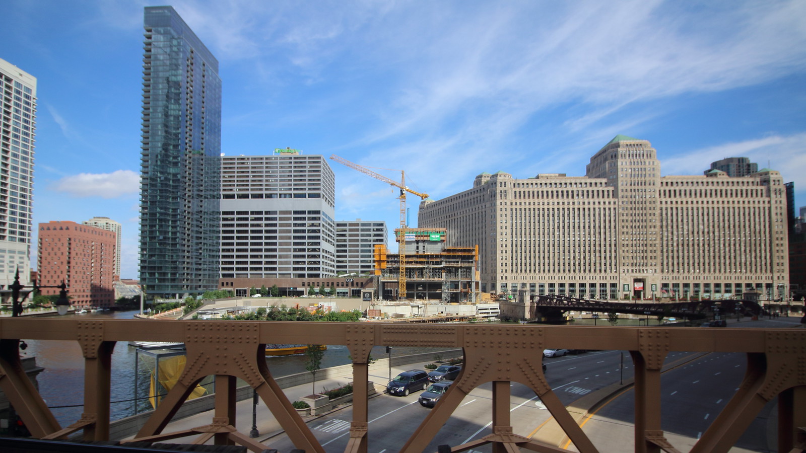 Sept 04 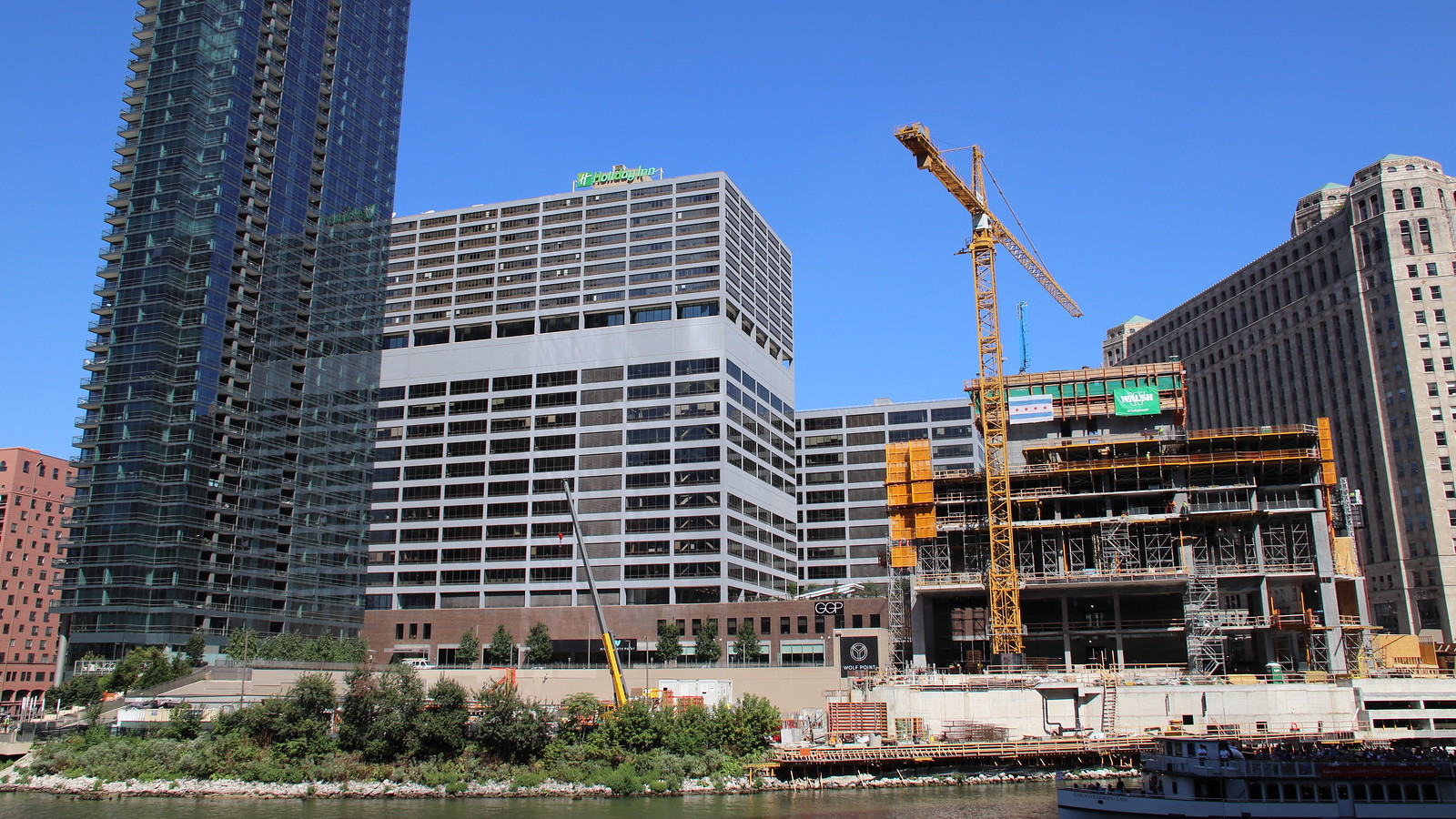 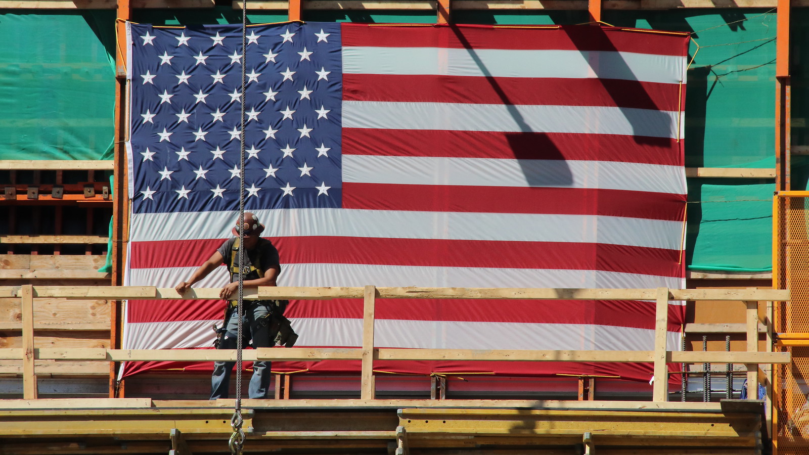 Sept 05 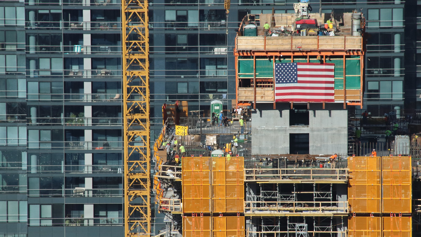 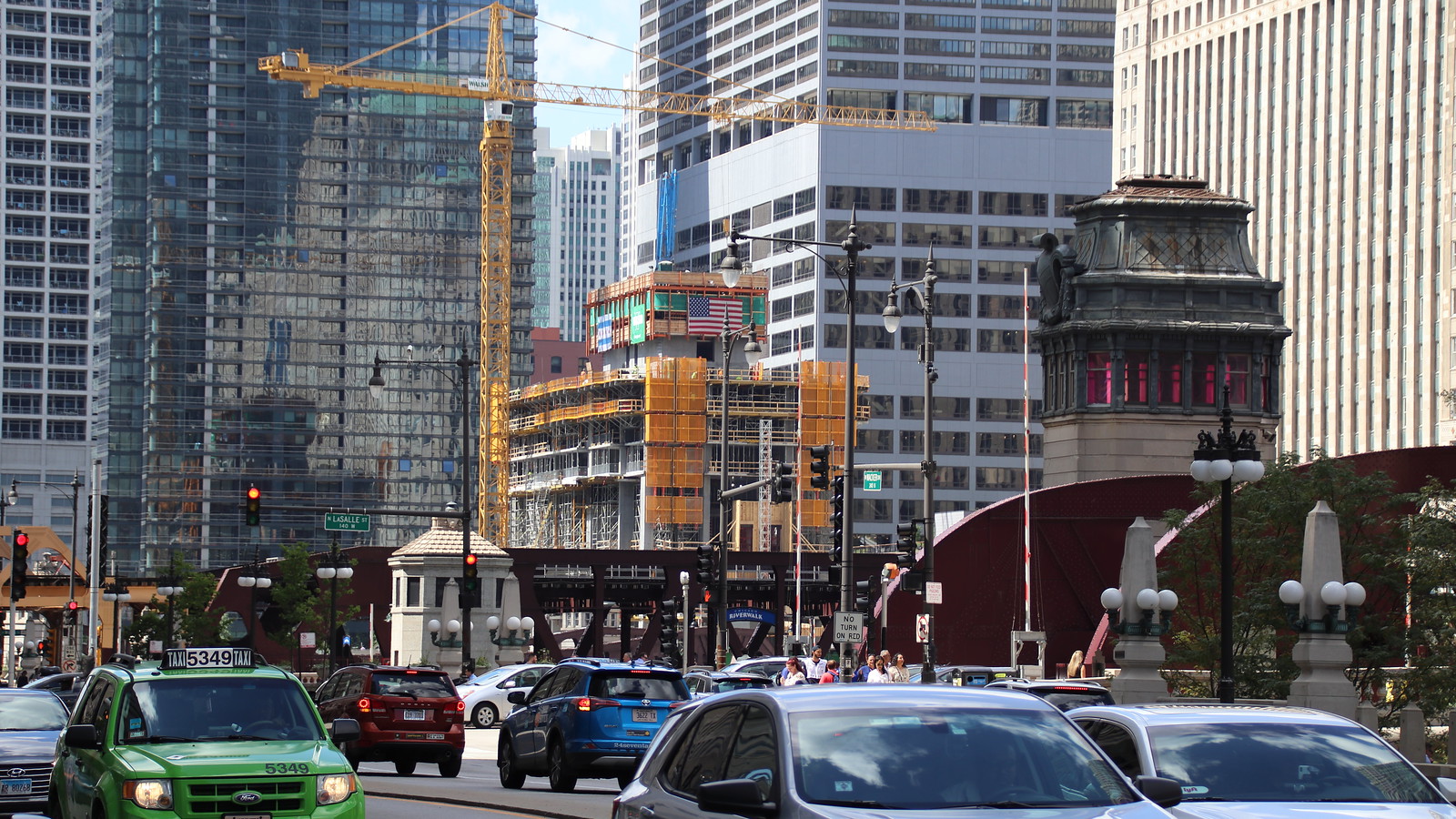 |
Quote:
I'm gonna go on record as saying in its original form the Mart's Apparel Center made more architectural sense as a brutalist styled expansion of the then filled to capacity Merchsndise Mart. The expression through massing and bulk reflected on the outside of the nearly windowless building the utilitarian power within. Not pretty but it at least had real theory behind it. http://i67.tinypic.com/29e54pv.jpg |
Respect.
|
Quote:
As for Kolchak, I think you know what I meant by old Sun Times building... This conversation is teetering on passive aggressiveness, so I'm just gonna step away from it now. |
all i know is they still have not painted the spot behind the holiday in sign.......starting to think they are going to leave that alone.
|
Quote:
|
September 4, 2018
 |
|
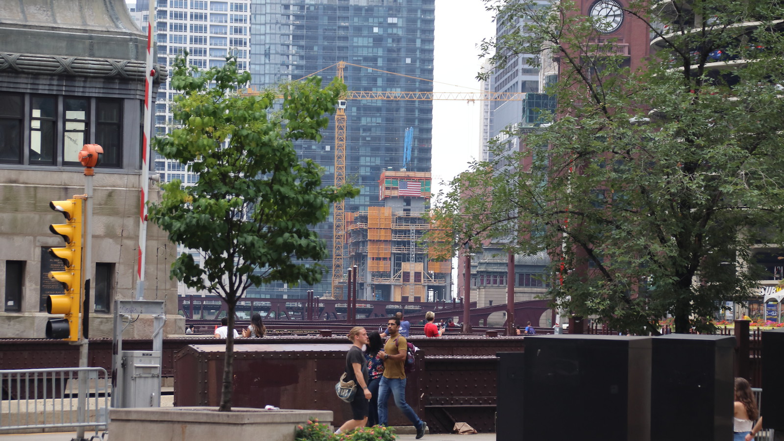
^ Now there's a vantage point we haven't seen yet! Great shot, PittsburghPA!
|
Thanks! I should be able to update with that view every few weeks.
|
Oooh so much eye candy :cheerleader:
|
Quote:
|
|
^Thank you for your frequent updates on this project. It really is a great perspective.
|
| All times are GMT. The time now is 3:51 PM. |
Powered by vBulletin® Version 3.8.7
Copyright ©2000 - 2024, vBulletin Solutions, Inc.
 Prev
Prev