Quote:
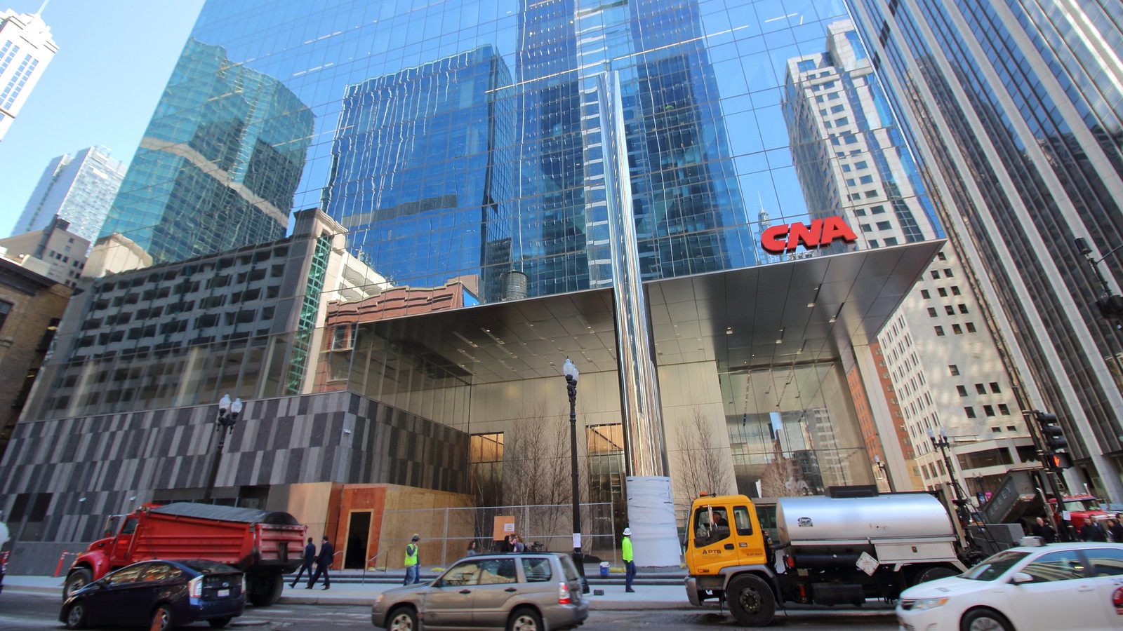
Imo there are just too many materials/textures/elements. Imo the one I dislike most is the staggered multi-color stone facade element. That would look better if it matched the simpler metal facade. The staggered ceiling recesses also clash with the staggered facade. They just aren't in harmony. I like the chrome column and glass walls. I actually like a lot of these elements individually - but all together they just don't flow. This is just my subjective opinion, of course. Ronan was actually a professor at my undergrad. Never took his studio though. Didn't know this was his. I usually love his stuff. He has a very clean, refined aesthetic. See the Poetry Foundation in Chicago. So this is kind of surprising. |
the shiny metal column, the atrocious stone "pattern" cladding at the base... yeah this one is a major misfire i wonder what happened. i think we were all expecting something at least refined from Ronan but... ugh no such luck.
|
Quote:
Yes, this building is better than the old two story Walgreens that was here. But almost anything else would have been quantitatively better than that previous use, that doesn't mean we have to settle for a dumpster fire of an office tower simply because it crossed the threshold of a bar that's been set very low. I don't know about you, but I'm not simply happy to settle for whatever blasé design happens to ride into town. This is Chicago, not Topeka. We can and should be critical of architecture that does not contribute to or meet the standards of the city's rich architectural heritage. |
Ok the patterned stone was a bad choice that clashes with the rest of the otherwise large seamless single color surfaces. The round column makes a lot more sense with rounded corners on the building which I'm guessing were VE'd. Otherwise it's a fantastic design. I think the cutout at the entrance that mirrors the park and overhang of the building to the west is really smart. Ronan is a fantastic architect but this design is not his best work.
|
Quote:
Most people know the Poetry Foundation because it's downtown, and that one is pretty refined for obvious reasons, but most of his buildings are on the South Side and look like this... all brightly colored and funky, with syncopated rhythms and textures. The entry at CNA Center is exactly the kind of thing Ronan does, it just uses an office-building language of granite, brushed aluminum and glass. http://i64.tinypic.com/2qlv8ep.jpg http://i64.tinypic.com/2hmlama.jpg http://i68.tinypic.com/k0pjz5.jpg |
Ever since the rounded corners got VE'd, I had been been rather meh about this tower. Every time I would walk past, it disappeared. It only reflected the sky and buildings around it.
Walked past about two weeks ago and the lobby changed my mind. It's interesting at street level. No gem but no dog either. |
April 19, 2018
 |
April 27
 Not a morning building - I will have to get back in the afternoon. 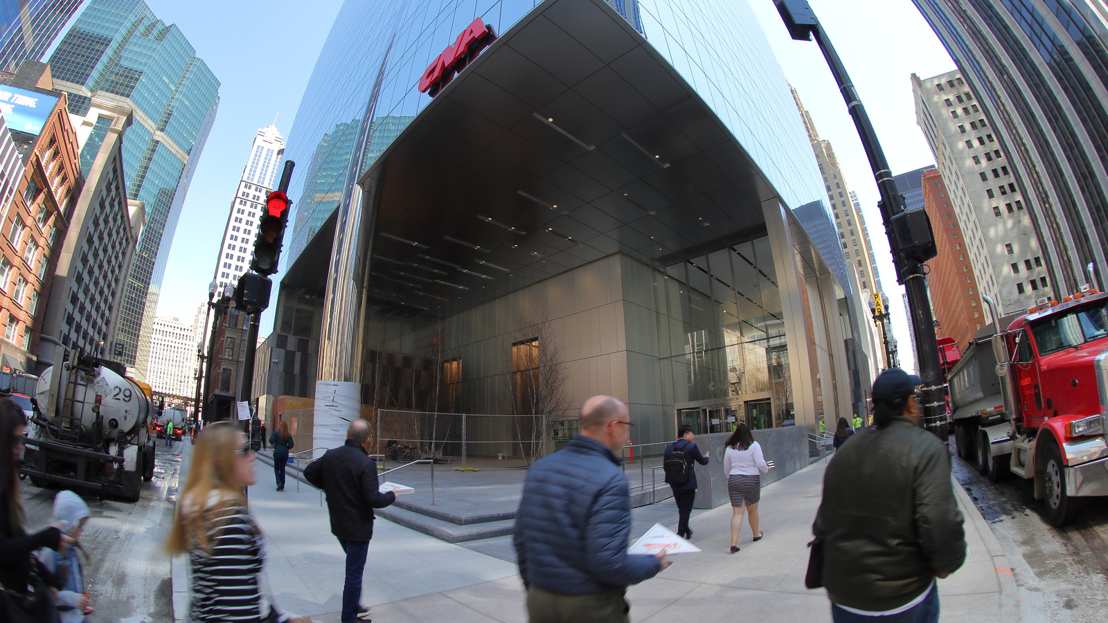 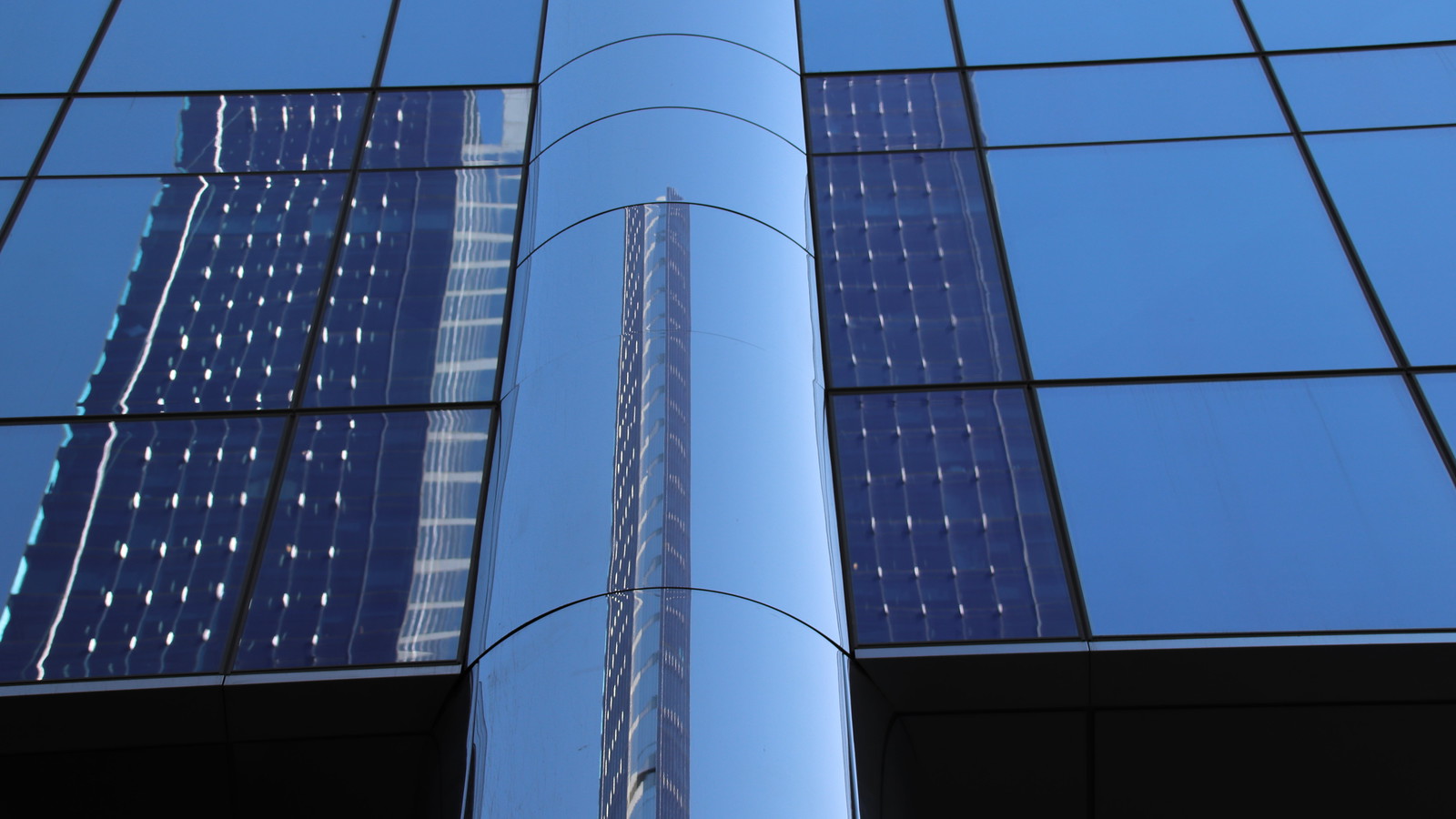 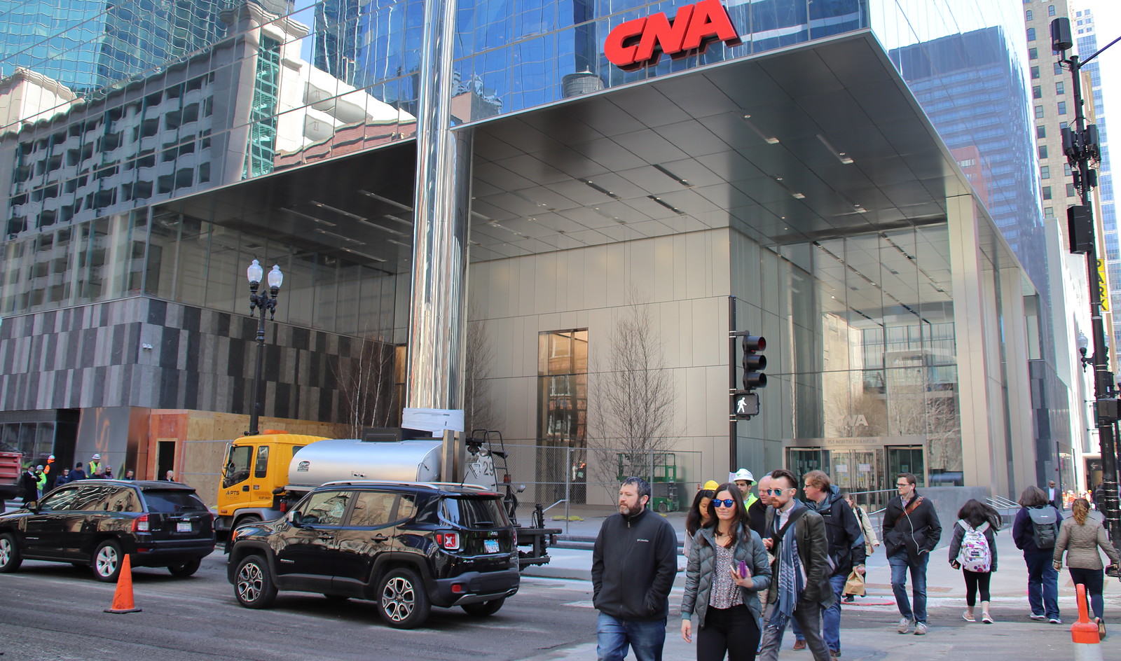 |
The ground level is turning out decent, at least
|
I hate to say it but this base turned out like garbage.
|
| All times are GMT. The time now is 5:14 PM. |
Powered by vBulletin® Version 3.8.7
Copyright ©2000 - 2024, vBulletin Solutions, Inc.
 Prev
Prev