Quote:
Originally Posted by SFView

Much of the building design had to do with the existing site conditions, zoning restrictions, and client needs. To have maximized floor plates as the client desires, the elevator cores are pushed to the corners spaces available at the west end of the site. This permits the largest free open office space possible within the confines of the building envelope and site. The architect team has done their best to integrate these limitations into what I feel is an excellent overall design solution.
Original source: San Francisco Planning


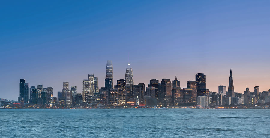
By the way, those of you who think the Parcel F is the last of the so called "supertall" sites in San Francisco, there is still another 700 foot plus site just west of Oceanwide Center. It is that "U" or backwards "C" shaped site just above Oceanwide in the bottom panel of the three drawings images above. This is the Golden Gate University site. Plans for this site are still pending. |
To those rightfully skeptical of oceanwide center:
the above reference to "client needs" and such
is sorta painful and reads like a press release.
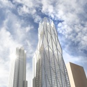
Some months ago, before the project was actually approved, i voiced concerns about the questionable western face of the building-- especially questionable in light of the way the renderings were presented.
As time has passed and the project has been approved anyway,
i have resigned myself to a Wait and See approach to this project.
In addition, after looking at the 50 first street details, i really dislike the exposed window washing equipment on the crown. too bad it was not disguised as was done on 399 fremont.
In addition, i believe a huge opportunity was lost when taking the blocky, painted aluminum, western face and not incorporating the same look and materials into the 605' building on mission street.
IMHO, this would have been kinda cool and interesting.
Yet, i have come to really think the eyesore is going to be the mission street tower which is a copy of horrible One Market Plaza. To me, the client needs were to build it "on the cheap".
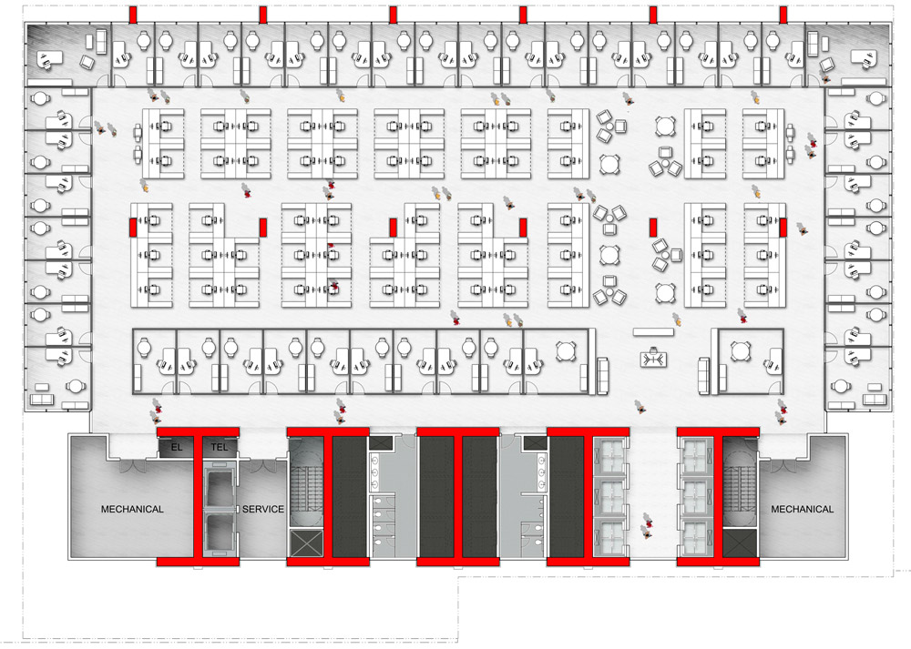
For those who do not like the irregular elevators, bathrooms and utilities on the western face of 50 First Street, the client is depending upon the fact that the lower half of the tower is blocked by several office buildings. It seems as if the upper, residential third has a bit more symmetry.
In addition, for those using the original design(s) of the pyramid juxtaposed with the final design, the argument kinda falls flat when viewing an early conception below--- with the elevators attached to one face of the building.
(right side of the picture below)
After downsizing the pyramid, someone had the good sense to actually give it a more symmetrical appearance.
As much as I would have liked a taller pyramid to balance-out the skyline with the Salesforce Tower, I am happy we got the shorter, more symmetrical design we see today.
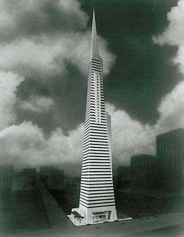
source: urbanlifesigns.blogspot.com


 Prev
Prev


 source: sf planning dept.


 Linear Mode
