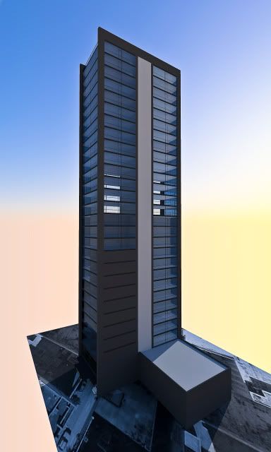
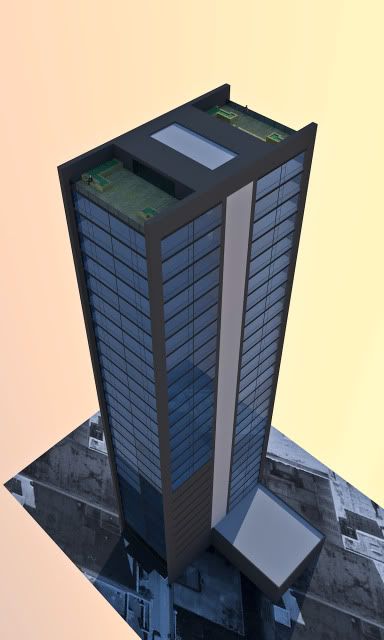
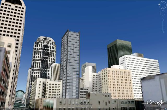
5th and Jackson is my latest project, I didn't do any skyline shots, but i did A LOT of renderings.
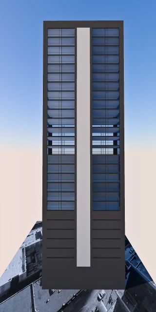
-5th & Jackson
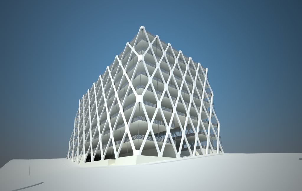
-135 ft tall
-Office
-9 floors
-3 underground parking
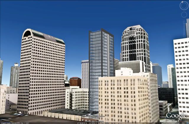
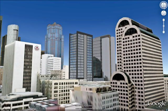
The building is located on 5th and Jackson, close to many important community and office buildings. Union Station and the International District Lightrail station are both situated across the street. This connects people from downtown as MLK/Seatac. Many local grocery stores and restaurants are also located nearby. To the West Pioneer Square is located, just a few blocks down. The South/East is the International District. North we have Downtown.
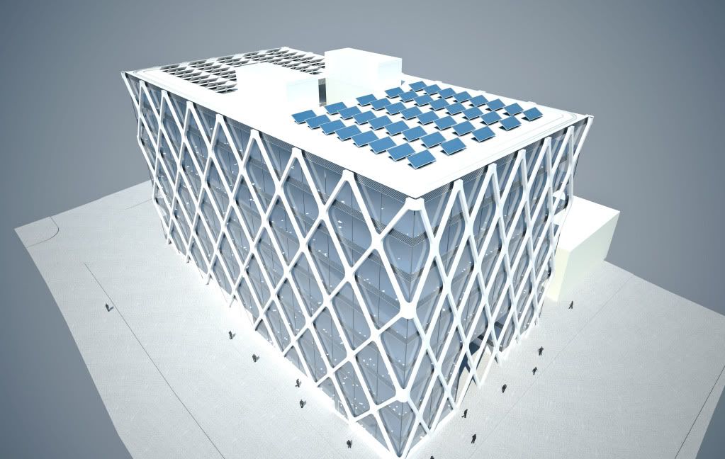
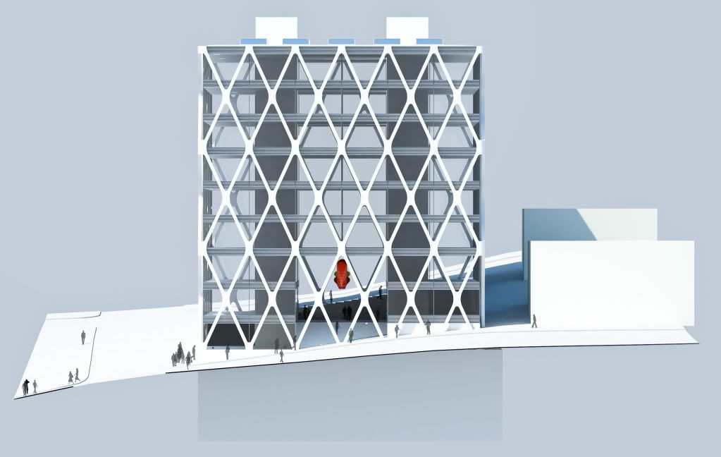
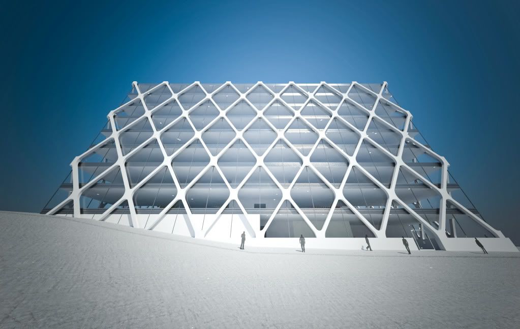
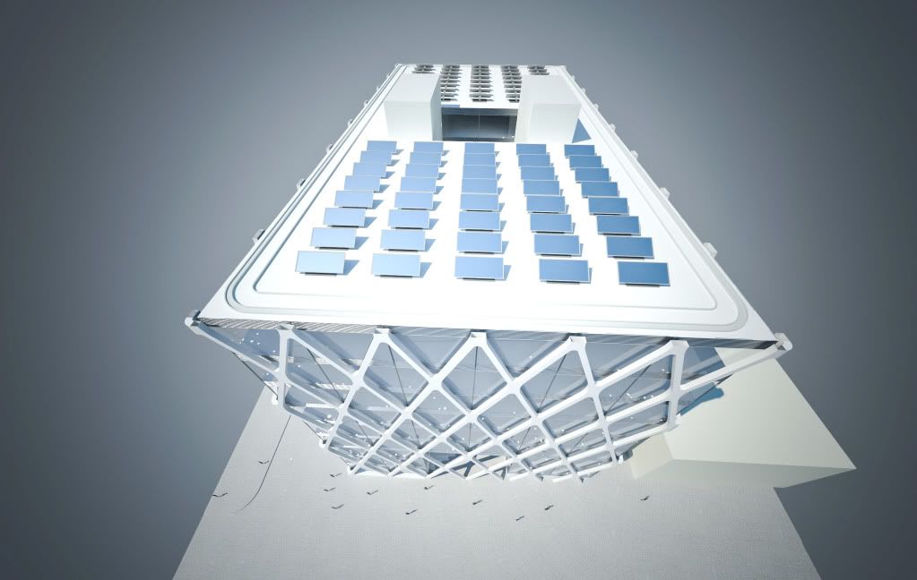
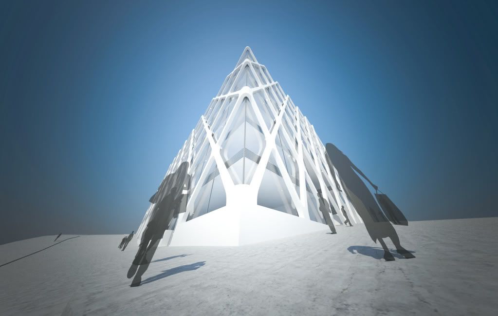
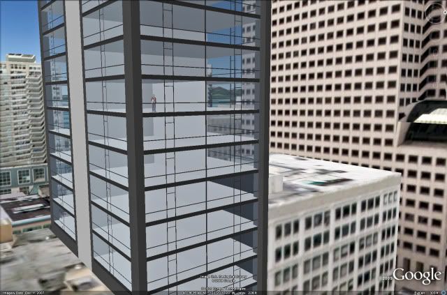
The buildings design was inspired by its location, new safety standards and the environment. The X-bracing eliminates columns in the office area and reduces the size of the cores. They wrap around the building to support the structure. There are 3 X-braces stacked on top of each other; in Chinese the number 3 sounds similar to the character for birth; and the same, this building would bring new birth to this area.
Along 5th avenue there are 8 braces, a number widely considered lucky in Asian countries. The number 8 symbolizes prosperity and wealthiness.
There are 9 stories above ground. Each floor has a ceiling-to-floor height of 10 ft and a floor-to-floor height of 13'6". In addition, nine is a lucky number in the Chinese community, symbolizing longlasting.
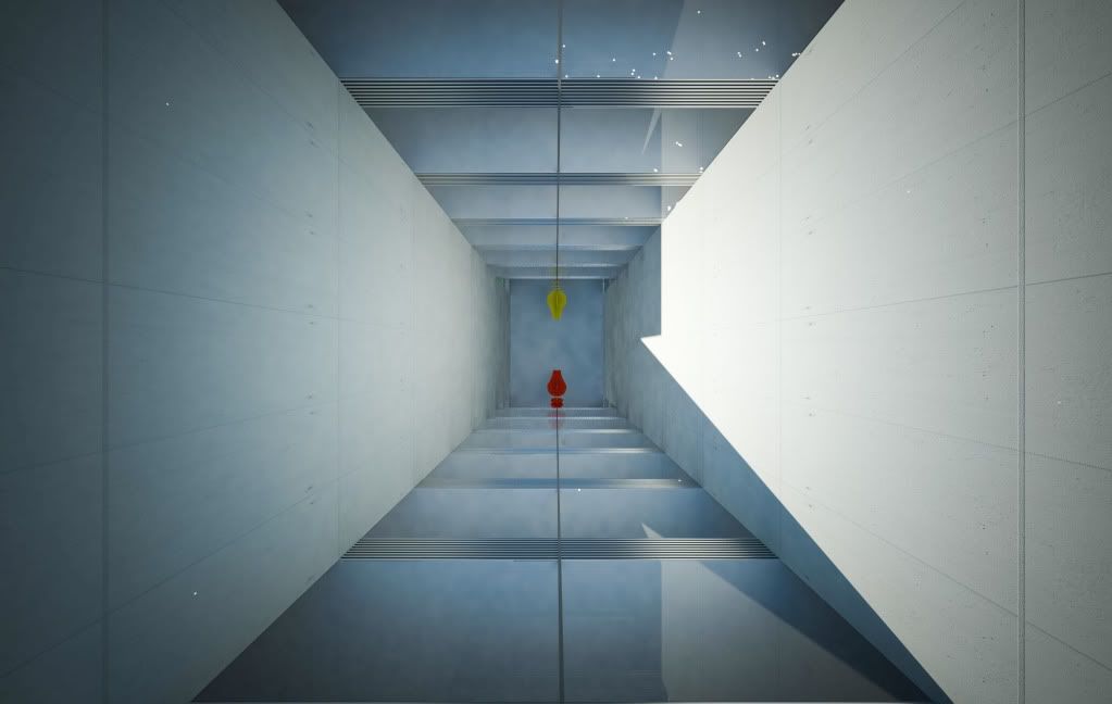
The buildings main entrances are located in the middle on the structure. An atrium cuts through the building North-South. The atrium is 3 floors tall with a central plaza and 2 staircases leading from Jackson to Main st.
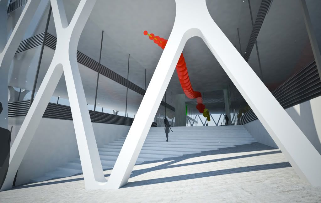
On the atrium ceiling there are two dragons located. The Red dragon on the South half faces inwards towards yet another atrium which runs up, through the building. While the North dragon faces South and is a golden color.
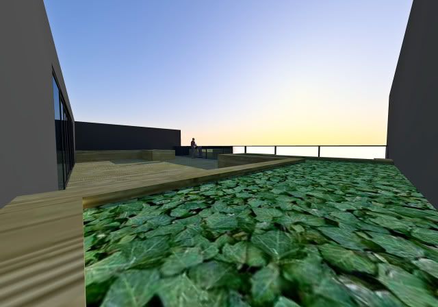
5th and Jackson also took the environment into the design. The roof is covered with solar panels which provide energy to the building. Water is stored in a 200,000 gallon tank located underneath the parking. Windows are coated with special glazing which change over seasons to minimize ultra violet rays from the sun and heat in the building. During hot summer months water is pumped up the cores which is then distributed throughout the building to cool it down and then re enters the underground tank. Floor-to-ceiling windows allow as much light as possible. Other things such as LED lights, recycled metal, carpeting and minimal water usage bathrooms also reduce the buildings impact. An automated window washing system uses little water and can fit though the space between the windows and braces.
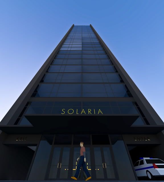
There is another entrance on 5th Avenue which allows handicap people to enter the building safely and ensured that they can access the main plaza with ease. At night the atrium is lit up and LED lights along the sides of the building light up the street to allow pedestrians and employees to feel safe.
thanks for looking! i hope you read my long explanation!
PS: If anyone can tell me why i'm getting those stupid white splotches i'll love you for the rest of my 6 lives.


 Prev
Prev


 Linear Mode
