HomeDiagramsDatabaseMapsForum About
     

Go Back   SkyscraperPage Forum > Discussion Forums > City Discussions


Reply

 
Thread Tools Display Modes
     
     
  #1  
Old Posted Apr 3, 2014, 5:09 PM
Steely Dan's Avatar
Steely Dan Steely Dan is online now
devout Pizzatarian
 
Join Date: Jul 2001
Location: Lincoln Square, Chicago
Posts: 29,821
Amazing Graphic Shows Chicago’s Middle Class Disappear Before Your Eyes

Quote:
Amazing Graphic Shows Chicago’s Middle Class Disappear Before Your Eyes
April 3, 2014 11:12 AM
By John Dodge

CHICAGO (CBS) — The graphic that you are about to see is sobering, perhaps depressing, and you can’t take your eyes off it.

We have the exhaustive work of Daniel Kay Hertz, a masters student at the University Of Chicago’s Harris School of Public Policy, to thank for that.

At the risk of sounding like an old carnival barker, step right up and watch the middle class of Chicago vanish before your eyes.

However, this is no side-show.

It shows the demise of the foundation of an American city.

Watch as the grey squares, which illustrate the middle class that dominated the most of the city’s neighborhoods in 1970s, quickly vanish over 40 years.

source: http://chicago.cbslocal.com/2014/04/...ore-your-eyes/


the biggest shift from gray to orange/red seems to be during the decade of the '70s. since then, the rich have been getting richer, and the poor have been getting poorer, but the full-on exodus of middle class looks to be slower today than it was back in the '70s. it's also intertesting to watch the emergence of the northside as the city's wealth corridor. back in 1970, the northside wasn't particularly wealthy beyond streeterville/goldcoast. my how times have changed. i wonder if we'll see green all the way to howard street in 20-30 years.
__________________
"Missing middle" housing can be a great middle ground for many middle class families.

Last edited by Steely Dan; Apr 3, 2014 at 5:37 PM.
Reply With Quote
     
     
  #2  
Old Posted Apr 3, 2014, 5:54 PM
Vlajos Vlajos is offline
Registered User
 
Join Date: Mar 2011
Posts: 2,485
Quote:
Originally Posted by Steely Dan View Post
source: http://chicago.cbslocal.com/2014/04/...ore-your-eyes/


the biggest shift from gray to orange/red seems to be during the decade of the '70s. since then, the rich have been getting richer, and the poor have been getting poorer, but the full-on exodus of middle class looks to be slower today than it was back in the '70s. it's also intertesting to watch the emergence of the northside as the city's wealth corridor. back in 1970, the northside wasn't particularly wealthy beyond streeterville/goldcoast. my how times have changed. i wonder if we'll see green all the way to howard street in 20-30 years.
I think that is almost certain to happen. I also think you will see green from the Near South Side to Hyde Park.
Reply With Quote
     
     
  #3  
Old Posted Apr 3, 2014, 6:12 PM
iheartthed iheartthed is offline
Registered User
 
Join Date: Oct 2009
Location: New York
Posts: 9,895
I'm curious of what it looks like over a century. Not sure if Chicago's borders were the same a century ago, but wonder how evenly distributed the income was over the long run.
Reply With Quote
     
     
  #4  
Old Posted Apr 3, 2014, 6:24 PM
emathias emathias is offline
Adoptive Chicagoan
 
Join Date: Sep 2007
Location: River North, Chicago, Illinois
Posts: 5,157
Bridgeport has also turned from pink to gray and will most likely go green by 2020. Once that happens, Bronzeville and Douglas will probably turn gray and then green by 2030, and with it probably also Kenmore and Oakland.

It's very possible that by 2040 the green areas will stetch from Howard as far west as either the River or Western (whichever is further west at any given point) south to 51st, and east of Martin Luther King, Jr Drive as far south as 63rd. By 2050, the green could extend all the way to Indiana, especially if the South Works development really takes hold, and Canaryville and McKinley Park could join green, too. At that point, Mike Payne's Gray Line might start to be taken seriously and if enough schools start to become tolerable and drug-sales-related crime is pushed out of the city into the suburbs, you could easily see an inversion that would transform places like the Lower West Side (Pilsen, etc), Gage Park, Brighton Park, Grand Boulevard, Washington Park and New City change demographics much faster than would ever seem possible today and once those big plots of land switch, there'd really be no stopping the rest of the city turning at least light green as long as there are jobs to support them. The City should be preparing for that by investing in smaller, non-Loop business centers in good transit locations for suburbanites who become willing to live in the city but don't necessarily want to commute to the Loop or drive to the suburban jobs centers.

In other words, Chicago will start to look a lot more like New York already does. That will mean, at least initially, lower population as places gentrify, but as families start to resume staying in the city, population loss will stop and then start to climb again. By 2070, I'd bet Chicago has a population over 3 million again. And it could even happen a lot faster than that.

Last edited by emathias; Apr 3, 2014 at 6:37 PM.
Reply With Quote
     
     
  #5  
Old Posted Apr 3, 2014, 6:48 PM
brian_b brian_b is offline
Registered User
 
Join Date: Oct 2005
Location: Chicago
Posts: 1,572
Well, I guess someone has to poke holes in the chart. So... this is deviation from the mean city income over time, not a measurement of middle class or not middle class. How has the mean city income changed over the same time period? Has it ever represented the middle class? Why do the different colors represent different sizes? You've got 45%, 15%, 15%, 50%, 25%, 50% and then finally everything else. And finally (most importantly?), each square represents a variable number of actual people.

I guess it's interesting in the same way other animated GIFs are interesting. But is it really telling us much of anything at all?
Reply With Quote
     
     
  #6  
Old Posted Apr 3, 2014, 6:50 PM
the urban politician the urban politician is offline
The City
 
Join Date: Jul 2004
Location: Chicago region
Posts: 21,375
^ Well, the SW side has a better chance of "flipping" gray and green than even Bronzeville these days. Going back to 1970, the strip of lakefront land between downtown and Hyde Park has essentially stagnated somewhere between gray, pink and red. No signs of any dedicated "forward" progress.
__________________
Supercar Adventures is my YouTube channel:

https://www.youtube.com/channel/UC4W...lUKB1w8ED5bV2Q
Reply With Quote
     
     
  #7  
Old Posted Apr 3, 2014, 6:55 PM
dave8721 dave8721 is offline
Registered User
 
Join Date: Jul 2005
Location: Miami
Posts: 4,044
Quote:
Originally Posted by iheartthed View Post
I'm curious of what it looks like over a century. Not sure if Chicago's borders were the same a century ago, but wonder how evenly distributed the income was over the long run.
If by that you mean incomes in the US in general getting more extreme (more rich and poor) fewer people grouped towards the middle, then yes that would be interesting to see. I'm sure this graphic would look the same for most US cities reflecting the loss of the middle class from US cities and also the degrading of the middle class in general.
Reply With Quote
     
     
  #8  
Old Posted Apr 3, 2014, 6:55 PM
emathias emathias is offline
Adoptive Chicagoan
 
Join Date: Sep 2007
Location: River North, Chicago, Illinois
Posts: 5,157
Quote:
Originally Posted by brian_b View Post
...
But is it really telling us much of anything at all?
Yes, it's showing that areas populated by the households with earnings falling within 25 percentage points of the median income are growing smaller, while areas populated both by households earning more than 25 percentage points above and 25 percentage points below the median are growing. It's also showing that initially the areas with people earning 25 or more percentage points below median grew much faster, within the past 15 years or so those areas have more or less reached an upper limit and now the number of areas where people are earning 25 or more percentage points above the median are expanding more quickly.
Reply With Quote
     
     
  #9  
Old Posted Apr 3, 2014, 6:58 PM
emathias emathias is offline
Adoptive Chicagoan
 
Join Date: Sep 2007
Location: River North, Chicago, Illinois
Posts: 5,157
Quote:
Originally Posted by the urban politician View Post
^ Well, the SW side has a better chance of "flipping" gray and green than even Bronzeville these days. Going back to 1970, the strip of lakefront land between downtown and Hyde Park has essentially stagnated somewhere between gray, pink and red. No signs of any dedicated "forward" progress.
Re: The south lakefront

I think the factors making that true would be overcome if it become surrounded by green, though. Part of what was dragging it down was there was no pressure to develop things for the upper market but if it's surrounded by green, that pressure would start to build.
Reply With Quote
     
     
  #10  
Old Posted Apr 3, 2014, 6:59 PM
BnaBreaker's Avatar
BnaBreaker BnaBreaker is online now
Future God
 
Join Date: Jul 2001
Location: Chicago/Nashville
Posts: 19,541
It's interesting to see how the poor are getting pushed further and further away from the core.
__________________
"Emancipate yourself from mental slavery. None but ourselves can free our minds."

-Bob Marley
Reply With Quote
     
     
  #11  
Old Posted Apr 3, 2014, 7:01 PM
Vlajos Vlajos is offline
Registered User
 
Join Date: Mar 2011
Posts: 2,485
Quote:
Originally Posted by brian_b View Post
Well, I guess someone has to poke holes in the chart. So... this is deviation from the mean city income over time, not a measurement of middle class or not middle class. How has the mean city income changed over the same time period? Has it ever represented the middle class? Why do the different colors represent different sizes? You've got 45%, 15%, 15%, 50%, 25%, 50% and then finally everything else. And finally (most importantly?), each square represents a variable number of actual people.

I guess it's interesting in the same way other animated GIFs are interesting. But is it really telling us much of anything at all?
It's a deviation from the metro area median family income, not just the city.
Reply With Quote
     
     
  #12  
Old Posted Apr 3, 2014, 7:03 PM
MonkeyRonin's Avatar
MonkeyRonin MonkeyRonin is offline
¥ ¥ ¥
 
Join Date: Sep 2006
Location: Vancouver
Posts: 9,915
The decline of the middle class is part of a wider societal trend that's been happening since the '70s. It's exhibited most extremely in cities, but by no means is it something limited to Chicago.


Income change in Toronto, 1970-2005:


Projected to 2025:

__________________
Reply With Quote
     
     
  #13  
Old Posted Apr 3, 2014, 7:34 PM
Crawford Crawford is online now
Registered User
 
Join Date: Nov 2003
Location: Brooklyn, NYC/Polanco, DF
Posts: 30,773
Very interesting maps. I suspect that most cities are roughly similar, but still interesting to see the shifts through the decades.

There could be some minor city variations, though.

Chicago has a municipal worker residency requirement, so all the teachers, cops, etc. have to live in the city. This means that, as long as that policy is law, there will always be "copland" type middle class areas within the city. NYC does not have such a requirement, and "copland" type neighborhoods within city limits are pretty rare (Staten Island, a bit, on the South Shore, and a few tiny areas in Brooklyn and Queens like Gerritson Beach.)

Also, Chicago has been more aggressive than other cities at demolishing public housing and less aggressive at building new non-market housing, and that type of housing is usually closer to the city center, so I could see the % poor dropping faster in core areas and rising faster in more fringe parts, near the city limits, compared to other cities.

Strangely, I bet you the % poor in core parts of NYC (lets say Manhattan) will not drop by a large amount in the coming decades. This is because all the public housing remains, and in fact the city has built lots of income-restricted housing, with much more planned. And most new luxury rental housing contains a 20% affordable segment (though little rental housing is built anymore in Manhattan; new construction is 90% for-sale).

In NYC, the large drops in % poor will not be in the very core, but in the near-core, in places where there are still poor people living outside of subsidized housing.
Reply With Quote
     
     
  #14  
Old Posted Apr 3, 2014, 7:55 PM
photoLith's Avatar
photoLith photoLith is offline
Ex Houstonian
 
Join Date: Feb 2008
Location: Pittsburgh n’ at
Posts: 15,495
Yay everyone is becoming more broke and income inequality is becoming horribly disgusting.
__________________
There’s no greater abomination to mankind and nature than Ryan Home developments.
Reply With Quote
     
     
  #15  
Old Posted Apr 3, 2014, 8:17 PM
Steely Dan's Avatar
Steely Dan Steely Dan is online now
devout Pizzatarian
 
Join Date: Jul 2001
Location: Lincoln Square, Chicago
Posts: 29,821
Quote:
Originally Posted by photoLith View Post
Yay everyone is becoming more broke and income inequality is becoming horribly disgusting.
what the map doesn't show is that the middle class has largely moved to the burbs of chicagoland, not that it disappeared entirely.

the map does display the falsehood of the whole "the city is too expensive that's why i moved to the burbs" notion that gets thrown around on SSP all the freaking time. the city is not too expensive. the parts of the city that middle class people would find acceptable to live in have become too expensive. there's plenty of home affordability in chicago, but to take advantage of most of it you're either gonna be way out in some fringe neighborhood or you'll be neighbors with gang-banging idiots and your children will go to sub-par schools.

it's the quandary my wife and i find ourselves in right now. we live in a small downtown condo. our first child is due this coming august. combined, we make decent money but we're far from rich; we can't afford a family-sized home (3 bedrooms +) in downtown or in pretty much any of the greener areas on the 2012 map. however, i am NOT gonna raise my family in some gang-banging, shitty schools neighborhood. so it looks like we'll be heading to the far northside or perhaps northwest side, but i don't like the idea of being so far from the lake (chicagoland's lone distinguishing geographic feature). we've also been quietly discussing potentially looking in bridgeport so that i might finally honor my paternal southside roots.
__________________
"Missing middle" housing can be a great middle ground for many middle class families.

Last edited by Steely Dan; Apr 3, 2014 at 8:37 PM.
Reply With Quote
     
     
  #16  
Old Posted Apr 3, 2014, 8:18 PM
the urban politician the urban politician is offline
The City
 
Join Date: Jul 2004
Location: Chicago region
Posts: 21,375
What's not being discussed with this graph is how much this reflects people getting poorer versus people simply moving around.

From the 1990's onward, richer people decided that Chicago's north side was a good place to live and they moved there, and continue to move there as well as into the core of the city.

From the 1970's onward middle class people fled the city and the poor people remained behind, especially in the south and west sides.

There have always been rich people, middle class people (albeit they are being squeezed today), and poor people, but what that map only tells us is their distribution over the years.
__________________
Supercar Adventures is my YouTube channel:

https://www.youtube.com/channel/UC4W...lUKB1w8ED5bV2Q
Reply With Quote
     
     
  #17  
Old Posted Apr 3, 2014, 9:57 PM
Mr Roboto Mr Roboto is offline
Registered User
 
Join Date: Mar 2006
Location: Chi 60616
Posts: 3,577
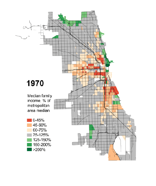
The main point to take from these graphs, the Toronto one included (although their situation is a bit different in Canada), is that the income inequality has increased in this country the reasons of which generally are some indirect fallout from the deregulation of the financial industry since the 70's, the reduction of low skill manufacturing jobs, and an overall increase in the cost of housing in general which was sparked by luxury home buyers creating speculation. Like others have said, this is not unique to big cities, but it certainly is more pronounced.

The fact of the matter is, city living is a far more attractive option for people in the last couple of decades, and as a result, without a relatively dramatic increase in housing supply in these areas the cost of housing/living near the core and north lakefront has risen. Therefore it requires high levels of income to live in these areas. However, if the housing supply in the green areas were to increase dramatically, and also that supply were to spill over into the nearby grey areas, and eventually the pink (not red) areas, you could see some better equilibrium.

At the very least you could potentially see a reduction in some of the red areas, as they could eventually become grey at least. As some have suggested I picture this happening in Bronzeville, the south shore, and Rogers Park/Edgewater etc.

However, the general trend is the core is unaffordable for most, and this area appears to be expanding outward into the surrounding neighborhoods

Quote:
Originally Posted by Steely Dan View Post
it's the quandary my wife and i find ourselves in right now. we live in a small downtown condo. our first child is due this coming august. combined, we make decent money but we're far from rich; we can't afford a family-sized home (3 bedrooms +) in downtown or in pretty much any of the greener areas on the 2012 map. however, i am NOT gonna raise my family in some gang-banging, shitty schools neighborhood. so it looks like we'll be heading to the far northside or perhaps northwest side, but i don't like the idea of being so far from the lake (chicagoland's lone distinguishing geographic feature). we've also been quietly discussing potentially looking in bridgeport so that i might finally honor my paternal southside roots.
Im in a similar quandry with my family in our existing space. Bridgeport appears to be a fairly attractive option. They have some very good CPS schools there, and their private options are strong and not overly expensive as well. Bridgeport will likely go green as well, but at least there should be some supply increase there as well, and they have a decent existing housing stock. We are looking at moving there or the near south (like oakwood shores or something) potentially one day.


Honestly, the supply thing gets me a bit. Developers should be looking at building more and more 3 bedroom+ or more condo units, or more townhome units, in the desirable and becoming-desirable areas. The light green to grey areas just outside the core. Maybe these 3+ units are not as profitable as 1 and 2 bedrooms, but I honestly feel that the larger units would still sell very well since there seem to be more and more people willing to raise their children in the city. And if the supply were to increase, the costs for these units would also level out a bit.
Reply With Quote
     
     
  #18  
Old Posted Apr 3, 2014, 10:42 PM
Reverberation's Avatar
Reverberation Reverberation is offline
disorient yourself?
 
Join Date: Jun 2006
Location: Diaspora
Posts: 4,460
Quote:
Originally Posted by Steely Dan View Post
what the map doesn't show is that the middle class has largely moved to the burbs of chicagoland, not that it disappeared entirely.

the map does display the falsehood of the whole "the city is too expensive that's why i moved to the burbs" notion that gets thrown around on SSP all the freaking time. the city is not too expensive. the parts of the city that middle class people would find acceptable to live in have become too expensive. there's plenty of home affordability in chicago, but to take advantage of most of it you're either gonna be way out in some fringe neighborhood or you'll be neighbors with gang-banging idiots and your children will go to sub-par schools.

it's the quandary my wife and i find ourselves in right now. we live in a small downtown condo. our first child is due this coming august. combined, we make decent money but we're far from rich; we can't afford a family-sized home (3 bedrooms +) in downtown or in pretty much any of the greener areas on the 2012 map. however, i am NOT gonna raise my family in some gang-banging, shitty schools neighborhood. so it looks like we'll be heading to the far northside or perhaps northwest side, but i don't like the idea of being so far from the lake (chicagoland's lone distinguishing geographic feature). we've also been quietly discussing potentially looking in bridgeport so that i might finally honor my paternal southside roots.
Congrats on the future kid! To your point, you are right that most of the red areas on the map are not of any interest to middle class families because they aren't acceptable places to live. No family wants to be the urban pioneers and roll the dice with their kids' education and surroundings. But there is more to it than the whole "rich get richer and the poor get poorer" claim. That is a myth that uses brief snapshots of how many people are rich vs. poor and what they make. Overall since the 70's everyone has been getting richer and rarely do people stay poor for decades. Most students starting in the workforce and new immigrants start poor and end up in the middle class or "rich" ten years later while new people have taken their place in the poor category. Only a very small number of poor people remain poor for more than a few years. The rub seems to be that the rich get richer faster than the poor which largely comes from compounding interest and other passive income sources. I'd bet that lots of those red neighborhoods reflect a landing pad for a growing number of immigrants and a starting point for people who are new in the workforce who need to be close to transportation and jobs but plan on moving the F out to the suburbs as soon as their paychecks justify it.
__________________
RT60
Reply With Quote
     
     
  #19  
Old Posted Apr 3, 2014, 10:44 PM
10023's Avatar
10023 10023 is offline
Registered User
 
Join Date: Jun 2007
Location: London
Posts: 21,146
But look at the North Side go!
Reply With Quote
     
     
  #20  
Old Posted Apr 3, 2014, 11:30 PM
dc_denizen's Avatar
dc_denizen dc_denizen is offline
Selfie-stick vendor
 
Join Date: Oct 2005
Location: New York Suburbs
Posts: 10,999
I think this graphic also illustrates the growth in Hispanic immigration, the exodus and replacement of older immigrant urban populations, and the implosion of African-American urban society quite well.

It's not like the same population was living in Chicago between 1970-2012, either experiencing decline from the middle class or elevation to the upper classes over that period.
__________________
Joined the bus on the 33rd seat
By the doo-doo room with the reek replete
Reply With Quote
     
     
This discussion thread continues

Use the page links to the lower-right to go to the next page for additional posts
 
 
Reply

Go Back   SkyscraperPage Forum > Discussion Forums > City Discussions
Forum Jump


Forum Jump


All times are GMT. The time now is 3:00 AM.

     
SkyscraperPage.com - Archive - Privacy Statement - Top

Powered by vBulletin® Version 3.8.7
Copyright ©2000 - 2024, vBulletin Solutions, Inc.