Months later I just keep finding better and better graphics on this topic.

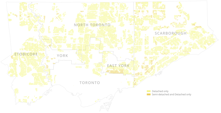
Here's the SFH-only yellow belt:
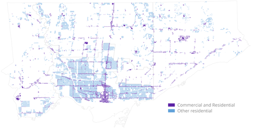
Vs. the "blue belt", which allow for more diverse housing types:
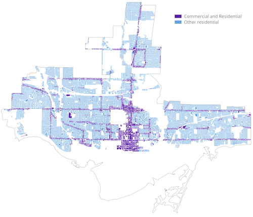
Zooming in on the central city, we can see that it's mostly blue:
However, if limited to areas that allow buildings greater than 12m (ie. 4+ storey buildings), it shrinks considerably:
To add to that, from this interactive map we can see that most of the lower-density zoned areas are actually
losing units, as well as population:
http://www.mapto.ca/maps/2017/4/17/i...-gta-2011-2016


 Prev
Prev


/arc-anglerfish-tgam-prod-tgam.s3.amazonaws.com/public/CRC3E6OHFFFLDEBCTMX4BHCYGU.JPG)
/arc-anglerfish-tgam-prod-tgam.s3.amazonaws.com/public/7XFLVTHF2ZCI5GTFGDIPX7G6WA.JPG)


 Linear Mode
