Here's a better article from the NYTimes, front page on the website tonight. You guys might want to chill out after seeing the REAL renders...so sad that NY's newspaper had a better spread on this museum than anything in Philadelphia...
http://www.nytimes.com/2009/10/07/ar...html?_r=1&8dpc
October 7, 2009
Architecture Review
Architects Reimagine the Barnes Collection
By NICOLAI OUROUSSOFF
Can a design convey an institution’s feelings of guilt?
That’s the question that came to mind when I saw the plans for the new Barnes Foundation in downtown Philadelphia, which are scheduled to be unveiled on Wednesday.
A few years back, the decision to move the Barnes, a revered American art institution, from its current location in the suburban town of Merion, Pa., to a site in Philadelphia’s museum district caused an uproar — not only because it brazenly went against the will of the founder, Albert C. Barnes, but also because it threatened to dismantle a relationship among art, architecture and landscape that was critical to the Barnes’s success as a museum.
For any architect taking on the challenge of the new space, the tangle of ethical and design questions might seem overwhelming. What is an architect’s responsibility to Barnes’s vision of a dazzling but quirky collection of early Modern artworks housed in a rambling 1920s Beaux-Arts pile? Is it possible to reproduce its spirit in such a changed setting? Or does trying to replicate the Barnes’s unique aura only doom you to failure?
The answers found in the drawings of Tod Williams and Billie Tsien, the New York architects who took the commission, are not reassuring.
The new Barnes will include many of the features that have become virtually mandatory in the museum world today — conservation and education departments, temporary exhibition space, auditorium, bookstore, cafe — making it four times the size of the old Barnes. The architects have tried to compensate for this by laying out these spaces in an elaborate architectural procession that is clearly intended to replicate the serenity, if not the eccentric charm, of the old museum.
But the result is a convoluted design. Almost every detail seems to ache from the strain of trying to preserve the spirit of the original building in a very different context. The failure to do so, despite such an earnest effort, is the strongest argument yet for why the Barnes should not be moved in the first place.
The old Barnes is by no means an obvious model for a great museum. Its unlikely suburban setting was partly intended as a tweak to the city’s wealthy downtown art establishment. Inside the lighting is far from perfect, and the collection itself, mixing masterpieces by Cézanne, Picasso and Soutine with second-rate paintings by lesser-known artists, has a distinctly oddball flavor.
But these apparent flaws are also what has made the Barnes one of the country’s most enchanting exhibition spaces. The creaky floors and cluttered rooms are light years away from the bigger, more blockbuster-oriented museums of Philadelphia, Washington and New York — a difference that has only grown more extreme in recent years, as museums have poured money into increasingly slick expansion projects. There are no distracting, superfluous spaces in the old Barnes — no education centers or contemplation zones. The homey atmosphere of the place reinforces a feeling of being engaged in an intimate dialogue with Barnes himself, not with an anonymous curatorial staff.
And the juxtaposition of magnificent and lesser works offers a to-the-point lesson in what makes great art and forces you to consider why your eye is immediately drawn to one work and not another. It makes art personal.
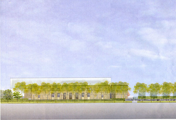
The artworks and galleries in the new Barnes will be displayed in exactly the same arrangements, but their surroundings will be grander and far more polished. The museum, composed of two buildings facing each other across a glassed-in court, will stand on Benjamin Franklin Parkway — the Beaux-Arts axis that runs from the foot of the Philadelphia Museum of Art past the Rodin Museum and the Free Library.
Visitors arriving from the parkway will follow a drawn-out path that begins on one side of the museum and then will turn to run along the front of the building before arriving at the main entry.
From there they will be able to peer across the court through a big floor-to-ceiling window at the building that houses the galleries.
It’s a perverse tease. Instead of heading directly to the art, they will turn into another room to pick up their tickets, and then turn back before entering the courtyard. From there they will make their way to the gallery building and another lobby. By then I’d be surprised if they had any energy left for the art. What they’ll need is a drink.
The desire to draw out the experience — which is meant to intensify it, but paradoxically ends up sapping it of life — continues inside the gallery building.
While the floor plan here is basically the same as in the original, Mr. Williams and Ms. Tsien have inserted new spaces into the sequence of rooms: a reading room, a classroom and a sunken garden court to allow visitors to take a break from the art. This has become a fashionable strategy in contemporary museum buildings. It was originally intended to combat “museum fatigue” and follows the notion that viewing room after room of paintings makes it harder to experience them fully.
But these added spaces also interrupt the sense of immersion that is so critical to enjoying art. The reading room feels especially out of place. In a model of the design, it is flanked by narrow corridors and looks a bit like leftover storage space. (The architects acknowledge that they have not fully resolved the room’s design.) And the Barnes’s intimate scale — it has only 24 gallery rooms — makes the point of such a space questionable.
To be sure, not all of the architecture here is so tortured. Mr. Williams and Ms. Tsien are known for their deft use of materials and they have invested a great deal of time in the feel of the individual spaces. The exterior of the building will be clad in gorgeous limestone from the Negev Desert, with a rough texture and creamy color that seem imbued with the weight of human history. Some of the panels will project out slightly, evoking the haunting forms of a Rachel Whiteread sculpture.
The main court, conceived as the museum’s social heart, will be paved in dark hardwood and look out onto a garden terrace. The architects hope eventually to connect the terrace to the Rodin Museum a short walk to the east, a nice idea that would strengthen the relationship between the museum and the park that surrounds it.
But even here the design seems somewhat strained. The stone panels are set in stainless-steel frames with occasional bronze accents, a system similar to the one that Richard Meier used at the Getty and that looks more and more fussy each time I go back to see it.
And a gigantic light bar that hovers over the main courtyard and projects from the end of the building feels like overkill: its translucent form, which will be lighted up at night, is nearly as big as the gallery building itself.
Still, the biggest problem with the design is not the fault of the architects: it has to do with the public the museum will serve. Part of the beauty of the Barnes Foundation is that it is so far removed from the tourist economy that drives major cities today. To get to it, visitors have to make an appointment, then take a train or a car to Merion, a half-hour from Philadelphia. These steps put you in a certain frame of mind by the time you arrive: they build anticipation and demand a certain commitment. They also serve as a kind of screening system, discouraging the kind of visitors who are just looking for a way to kill time.
The new Barnes is after a different kind of audience. Although museum officials say that the existing limits on crowd size will be kept (albeit with extended hours), it is clearly meant to draw bigger numbers and more tourist dollars. For most visitors the relationship to the art will feel less immediate.
And this, alas, is a problem no architect could have solved.


 Prev
Prev


 Linear Mode
