Quote:
Originally Posted by Echoes

|
Disgusting. The old one was very classic.
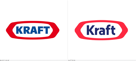
The only thing that needed to be changed with the old logo was a colour update as that type of golden-yellow looks dated. In the most extreme case, you could have just softened the text and the Wheat - something along the lines of how Kraft has done with their logo to "modernize" it: